Local or did you order the stickers online?
Can you tell me the dimensions for your stickers? The height and width?
I ordered them online, I would love to send you the link. Text or email me your number or email
[email protected]
503-508-3488
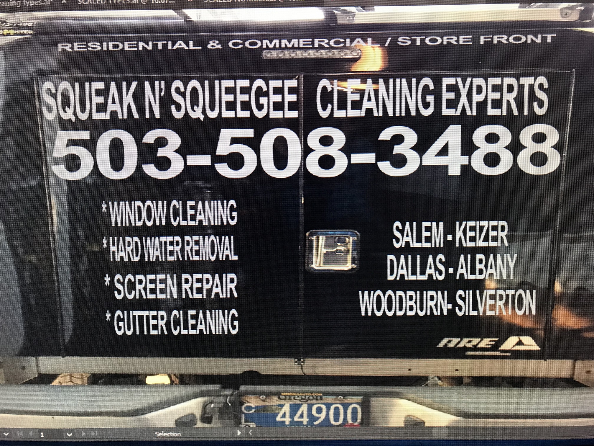
Alright guys I’m about to order my new decals from 1060 Graphics (also available through there store on amazon.com).
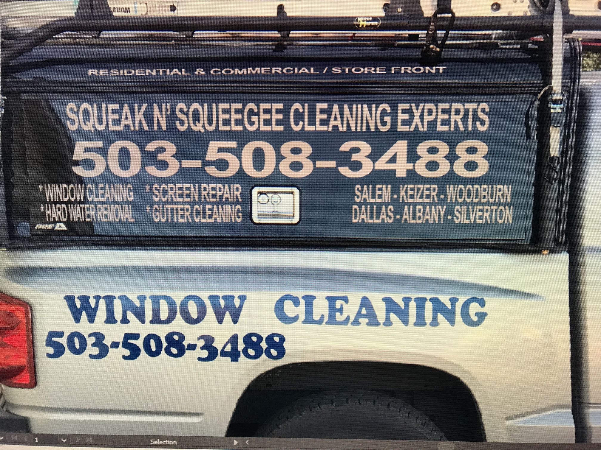
Here are my current configuration, any suggestions? This is all done in photo shop so I can change whatever?
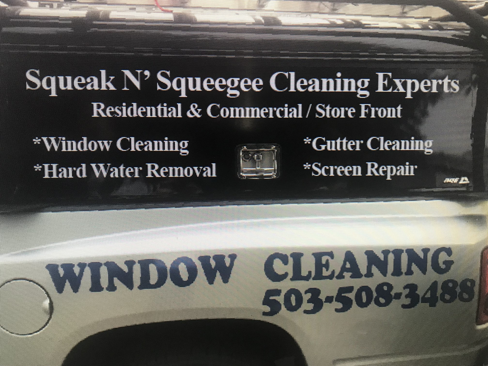
I’m thinking of removing the blue logos down below and replacing them with just a phone number ?
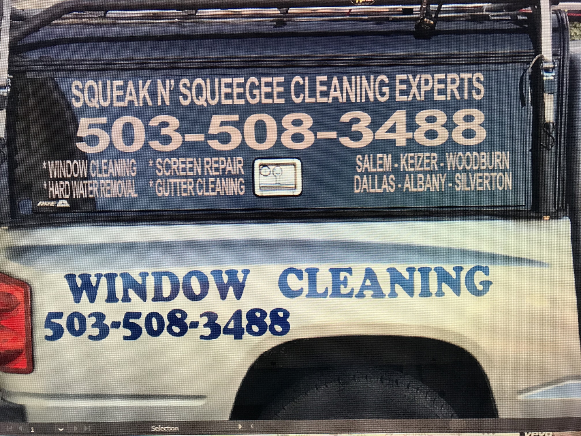
Or completely removing and doing this one
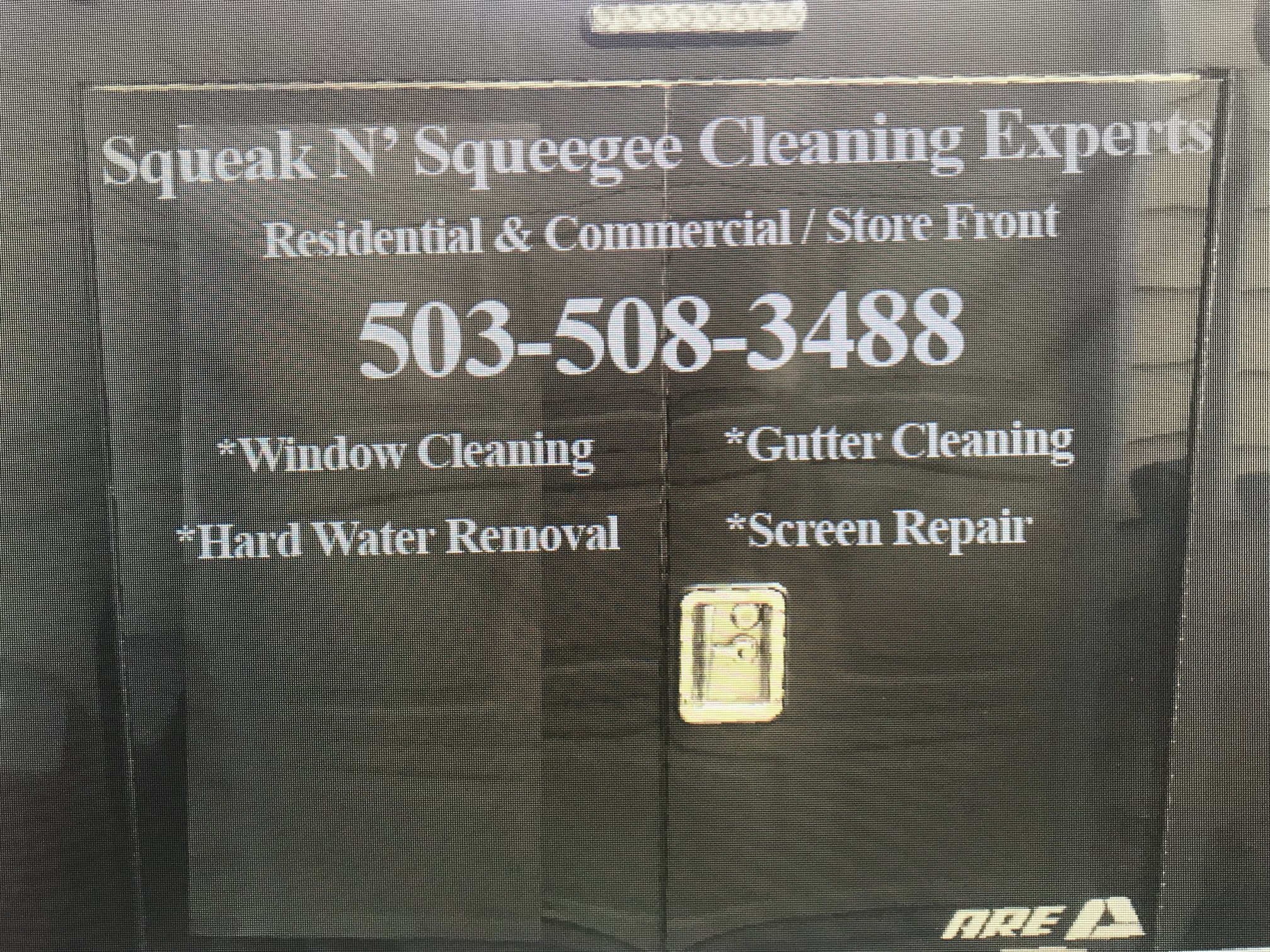
Bottom pic. / Topper idea looks great…yes, you could lose the fender stuff…but what if you took the topper off? Anywho… looks crispy and professional. 
The shell can be removed by wouldn’t be logical. That’s basically permanent
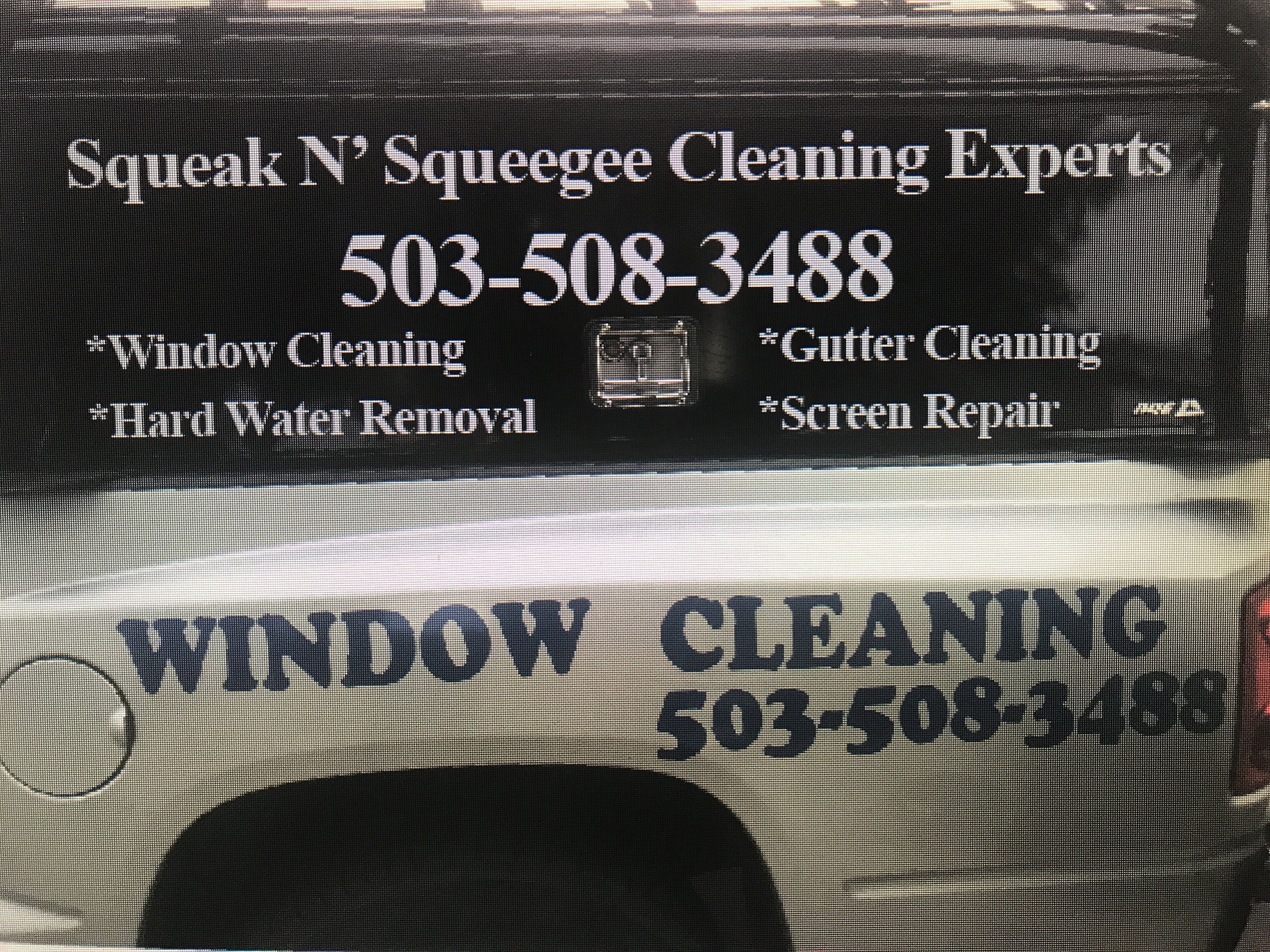
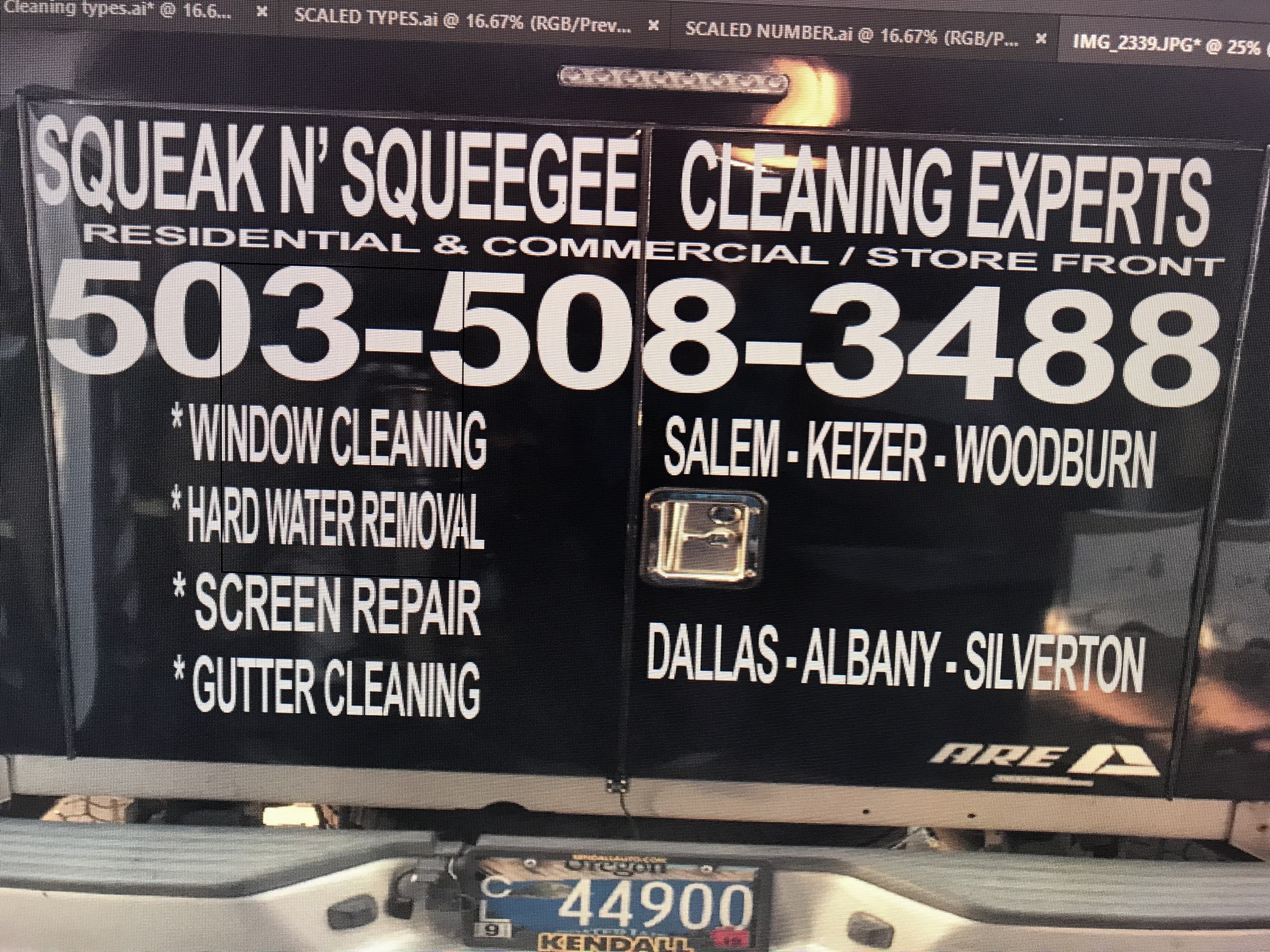
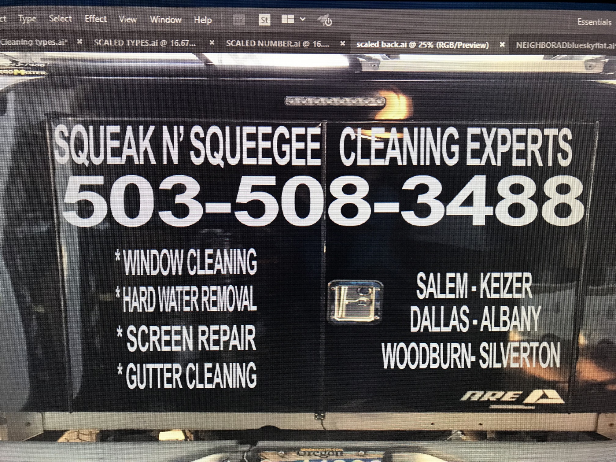
New pictures. I used adobe illustrator to bring it to scale and reorganize.
Feed back? I’m going for basic and plain.
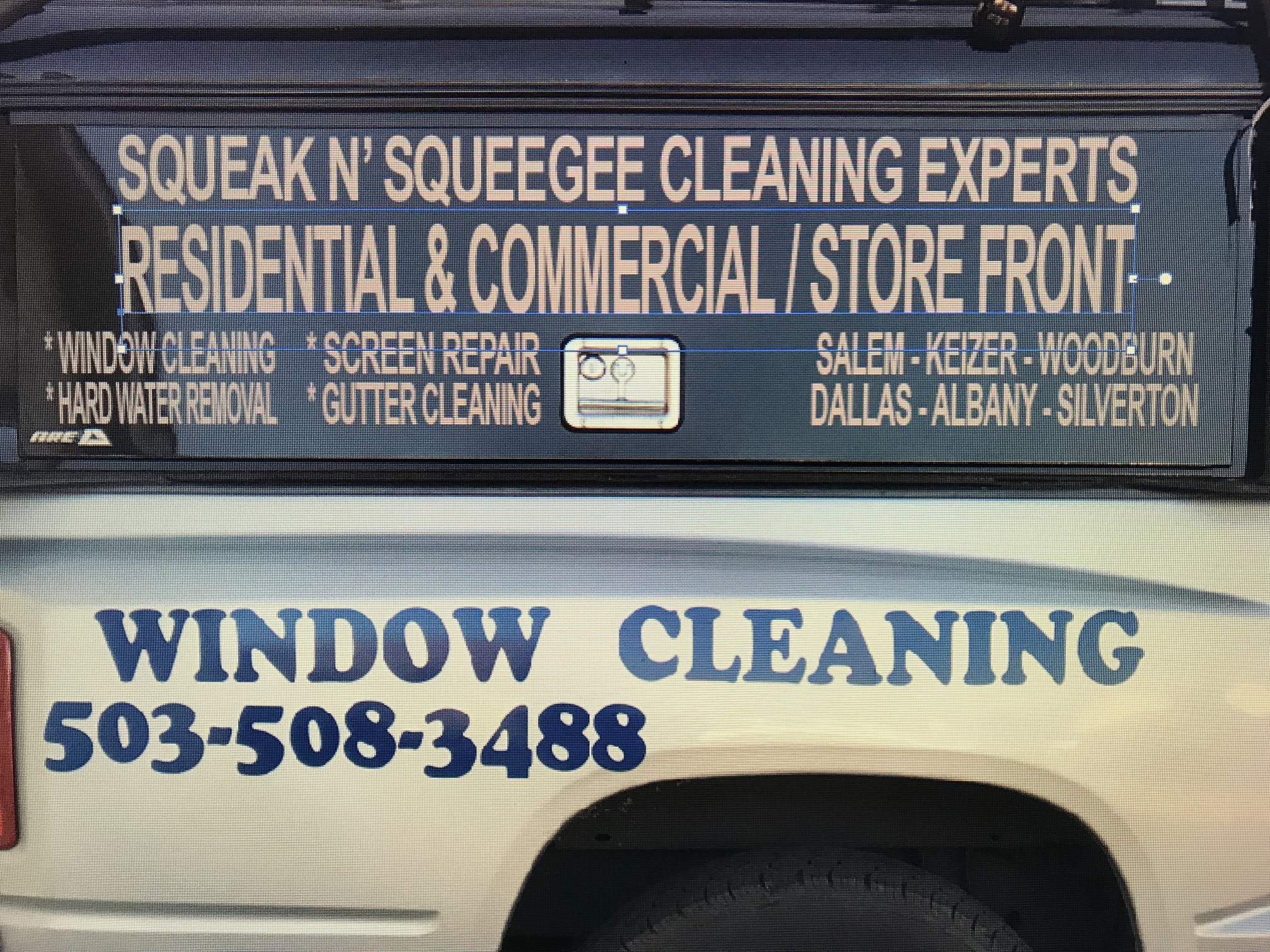
Just a thought, all-caps is harder to read than regular text. We usually read by identifying the shapes of words. All-caps requires us to read every letter.
Also, I think your letter spacing on some of the text is just a little too tight. Less is more. Think about what you absolutely need to say. I always get carried away when designing signage, and end up regretting it later.
Try emphasizing just your favorite/most profitable services. I listed Power Washing and Window Cleaning, in that order on my vehicle. I also put PW’ing as our primary service on our online listings. I’m still 85% wc’ing, but I like pw’ing better and make better money on it. I also do some gutter cleaning, but didn’t even bother to put that on the signage.
3 Likes
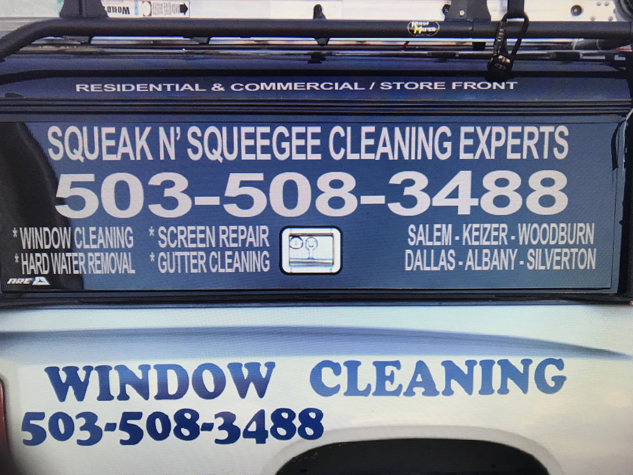
I like the lower case better, but that’s just my preference.
I think the services text is a little too condensed to read clearly. Maybe leave out window cleaning (since it’s already on the bed of the truck in huge letters) and one other service, and instead put “+ gutter cleaning, … & more”
Also might want to get rid of the repeat phone number. Could use that space for website, or just make window cleaning even bigger.
Your service area could be simplified to “serving the greater salem area”, instead of a list of towns. Easier to read at a glance.
Also, too many different font styles and sizes get confusing to the eye. Try changing the large “window cleaning” text to the same font as the rest, maybe in bold.
Ultimately, you’re the one who’ll have to live with it. Thankfully, vinyl lettering is cheap and easy to remove, so if you get tired of something, you can always peel it off.
Tbh, I’m already growing a little tired of the signage on 4-slice. I made it too busy, and people have trouble getting the message quickly. I mean, I love the way it looks, but it just doesn’t convert.
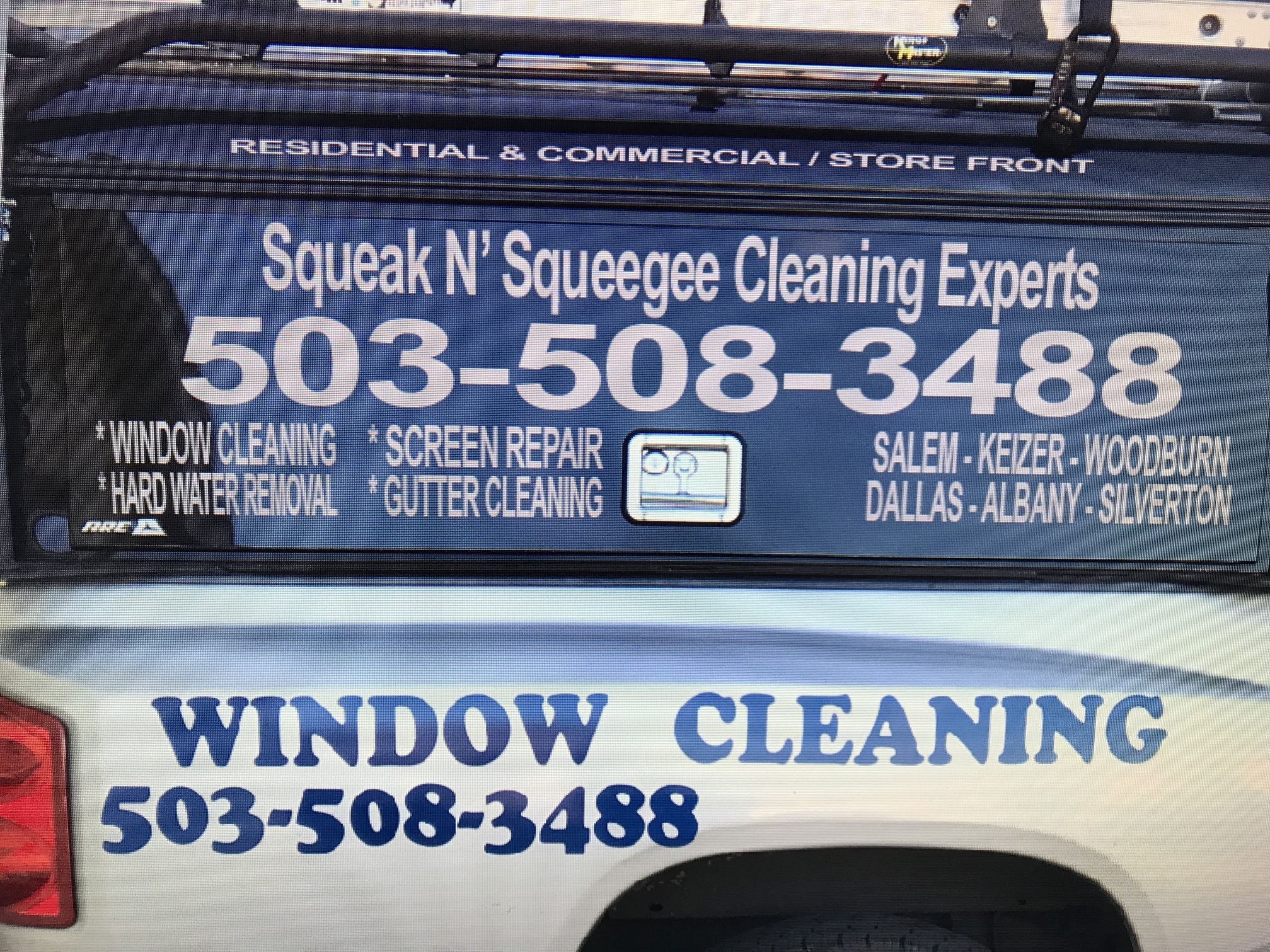
The blue window cleaning and phone number are already on truck and will be removed eventually. All the fonts on the black shell are exactly the same.
Otherwise thank you very much for the feed back.
