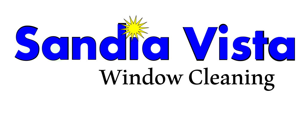
Thanks guys. I drew it up without the squeegee and the elliptical doesn’t flow with the logo without it. It just looks like it’s added without much thought.
I’ll post some pics later to get a consensus. One way or the other, I need to make a decision today so I can focus on something else.
I would rather have my company’s imagery ‘scream “Professional!”’ This image certainly looks amateurish, but if you want that look and believe it has worked well for you, I’m glad.
You said “amateur” is in every thing you do, but I don’t believe your window cleaning work screams “amateur”. You’ve been around here long enough that I’d suspect it screams “pro!”
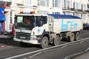
i believe i might have got the amateurish idea after seeing one of these Brett construction trucks. Brett are a very big firm. i DO do professional work, of course we do,but non of my workers wear anything that looks pro, mismatched trackies and cheap shoes mostly. that reminds me ,last year i had an employee with a skid mark on the back of his new trackie bottoms. this stain grew n grew as the weeks went by and it was an omen, he didnt last long in my employ
Strongly dislike the first one. Love the second one. Third is also very nice.
Would like to throw in that the “explosion” (is that supposed to be a sunrise?) over the first “i” seems…idk… Just kinda out of place, maybe. Just my opinion.
I don’t like the first one either. Too much blue. The star just gives it a focal point that draws attention to the name. To me it makes the name memorable. I like it. I might make it a different color though, maybe silver.
The elliptical needs something, but it does add to the graphic and the piece I read about circles in advertising having a positive impact on consumers has stuck with me. I have to consider that it will be embroidered on polos and possibly on the side of my truck so it will make the logo pop and be more noticeable. I’m also getting positive feedback on the squeegee offline. The squeegee doesn’t bother me in the sense that its over played, but it does have an amateurish look, which I don’t want. I might spend a little more time on it tonight, but I need to make a decision.
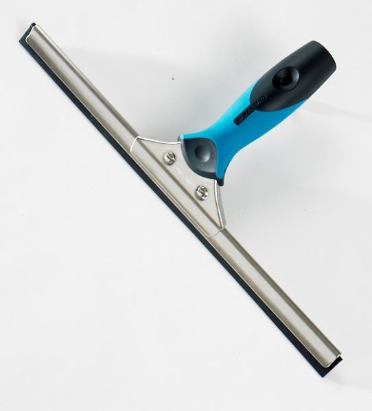
Don’t feel like you can’t use a squeegee in your logo. Rules are meant to be broken. I get a ton of compliments on our logo - primarily from female customers.
I would suggest starting with an image of a real squeegee, like the unger ergotech that’s in our logo. You can change the color of the handle to match your lettering, or find a good pic of a classic moerman squeegee (non liquidator style- they’re too complex an image)
I would have the squeegee blade extend nearly all the way across the S and A, maybe just to the point where the letters start to curve downwards, if you can picture what I’m saying.
I would also consider maybe a more subdued blue, almost like what @Tony_C has in his logo (which is genius in its simplicity, btw).
I’d do a mockup for you if I was in front of the computer and had the time. I love this kind of stuff.
Oh, and +1 on losing the starburst. I don’t think it adds anything to it.
Edit: here you go. Trim out the bachround and rotate and you should be good to go. It would be polite to write Moerman for permission to use it.
[quote=“Alex_Lacey, post:69, topic:39564”]
Don’t feel like you can’t use a squeegee in your logo. Rules are meant to be broken. I get a ton of compliments on our logo - primarily from female customers.[/quote]
There are no rules about this stuff, just opinionated window cleaners chiming in with suggestions. I expressed a strongly-held preference / opinion about squeegees in WC logos, but it is nothing more than one window cleaner’s opinion. There is no right or wrong answer here. Not all logos with squeegees are bad and not all logos without them are good. There are a lot of logos out there that I personally hate, but so what? They successfully identify their company. In the end, go with what you believe will resonate with your clients and identify your company. Listen to suggestions, read a lot about logo design and then settle on a design that you can live with (You need to live with it, not us) so you can be done with it and move on.
I used GIMP to do all my drafting and cleanup work (I’m more comfortable working with raster graphics).
Then I used the bitmap trace in inkscape to convert it to a vector graphic (google it- I couldn’t explain how to do it if I tried ). I used the maximum number of layers it would allow (256 IIRC) so that I could preserve the gradient/embossed look of the handle and lemniscate. You might actually want a flat look for your logo, idk.
You’re probably better off doing as much as possible in inkscape. Bitmap trace is kind of a lazy, inelegant method for logo creation.

 trackie bottoms. this stain grew n grew as the weeks went by and it was an omen, he didnt last long in my employ


 ). I used the maximum number of layers it would allow (256 IIRC) so that I could preserve the gradient/embossed look of the handle and lemniscate. You might actually want a flat look for your logo, idk.