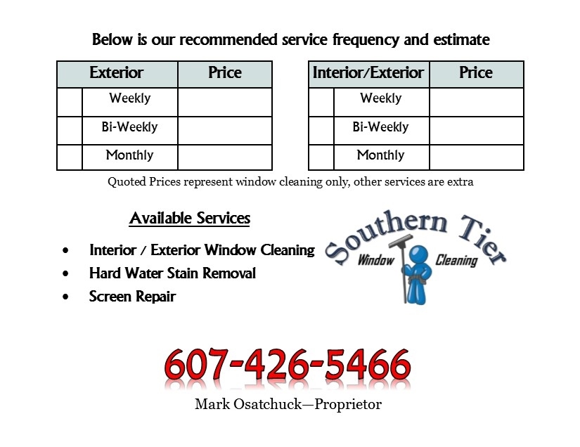
I created this post card size flyer on Publisher and printed it out on card stock…front and back.I have given this to the decision makers in each business I visited. The last week and a half,I have visited roughly 50 businesses and landed 6 accounts…with a possible 4 more possibles that I am waiting on a call from early next week
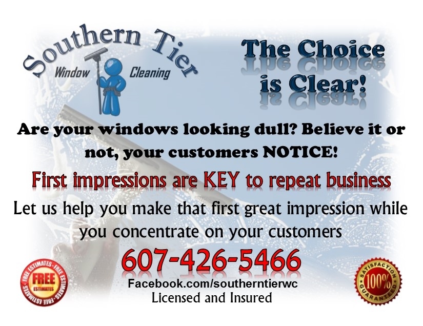
My question…is it too “busy”? Is there just too much clutter? Your feedback is much appreciated…
Thanks…I appreciate that!..And they seem to really like getting the quote on the back like that too!..I believe it will result in callbacks down the road too from those who did not make an immediate decision.
Monday is my follow up day…and Ughhh,I just checked my business phone…I have not been taking it to my full time job with me, but that will change as of tomorrow as I got two phone calls!..One, for service at a Pizza place I already serviced…one of those that I was concerned about n a last post…I felt the quality was bad…because of grease build up on the windows…Well,he must have been happy because he wants me to service their new location that is opening next week!..BOOM!..and the other is from a Law Office…and that one in particular can definitely get me referrals!
I think I just might be able to make this business venture a success!..Thanks for all the support out there!
It looks really nice, color scheme, layout and all. I agree with Chris about dropping the shadows.
And for me it’s a tad wordy. I would drop “Are you windows looking dull?” But leave in " Believe it or not…" and drop “Let us help you…”
I think that there is too much happening on the front. I suggest trying to say more with a lot fewer words. Most people are not going to read all of that, even if it would only take them a few seconds. They just won’t.
Try for a simple, bold headline and a couple of bullet points, nothing more. Your flyer needs to get their attention, not tell them everything. After you have their attention, then you give them all of the details yourself, in person.
A graphic design principle is that open space is your friend. Don’t try to use every square inch of the flyer. Chris is right about the drop shadows. I would consider getting rid of the “Free Estimates” medallion. Free estimates are assumed. Less is more.
The two things that I had concerns about…The drop shadows and too much happening on the font, are the exact things you guys pointed out!..I’ll definitely tweak it. That’s why this forum is second to none…The advice is always top notch!
And @BostonMike … I tried my hand in Radio advertising for a while…the pay sucked, but I enjoyed creating ads more than anything!
My door hanger has a lot of words and extra information on the back. I have had multiple people tell me the reason that they called me was because of the catchy professional look of my door hanger. So to say “They just won’t” doesn’t fly, they will.
I agree with @Tony_C that less is more. Attention spans are dwindling and people hate reading, not to mention they are strapped for time.
In advertising the most important thing is the feeling the viewer feels. So if it feels professional and they get the gist of what you’re offering, it will work.
The whole card looks good to me. However the verbiage “are your Windows looking dull?” Seems weak. “Your Windows are looking dull” maybe. Assume the sale.