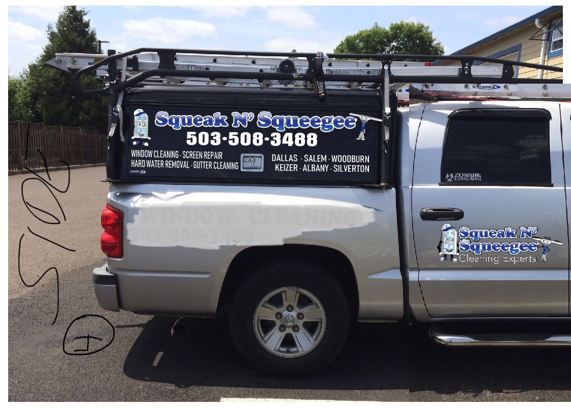
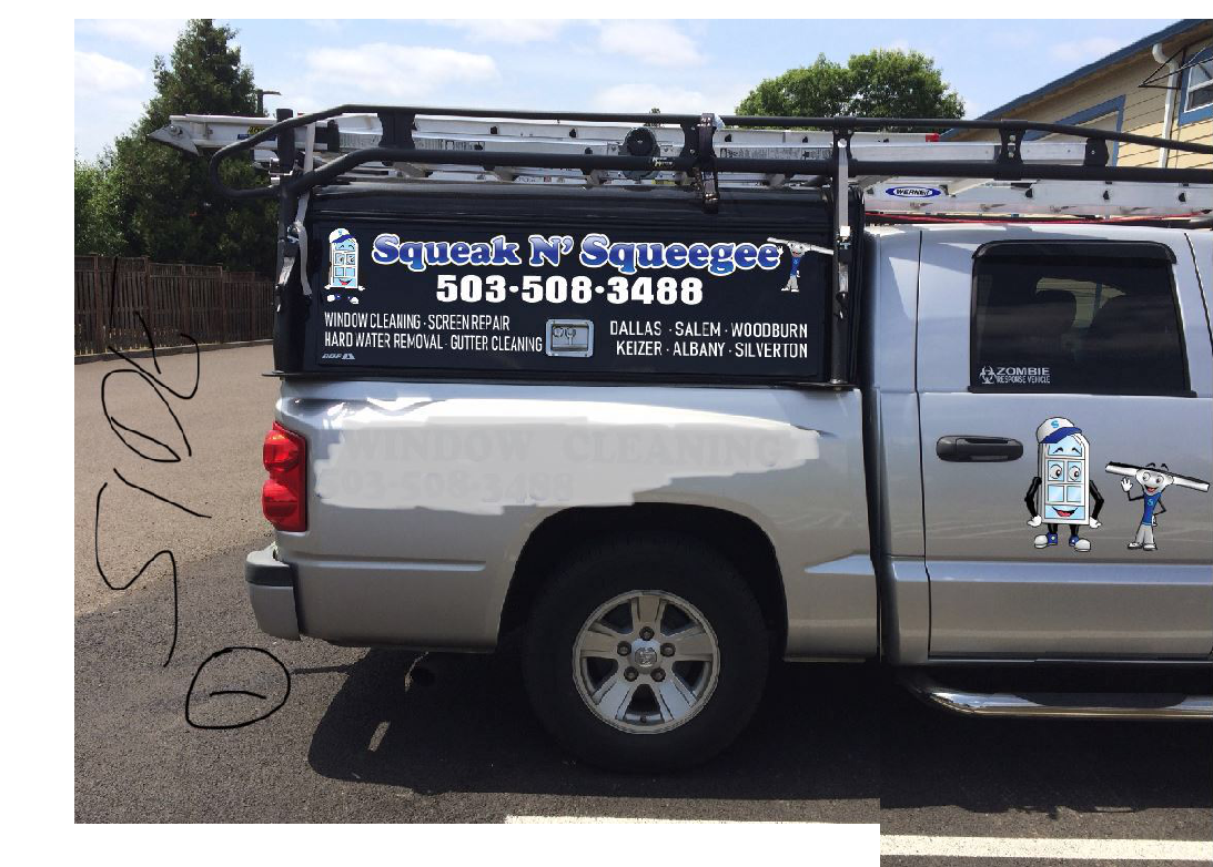
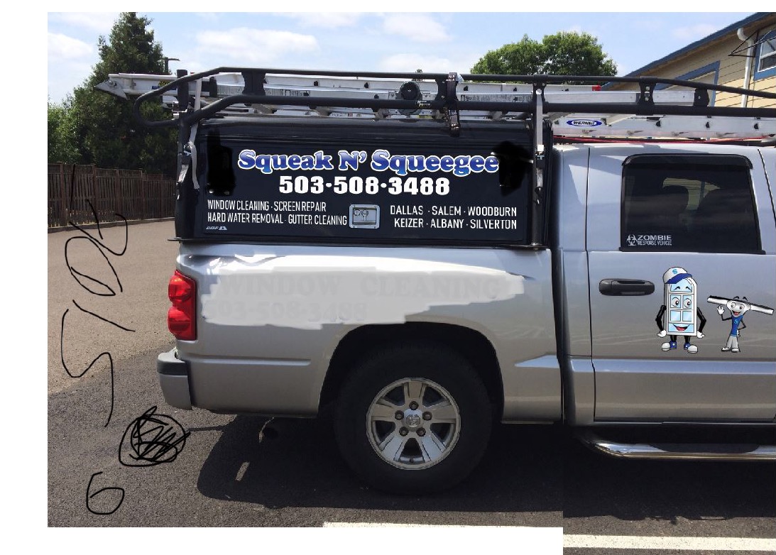
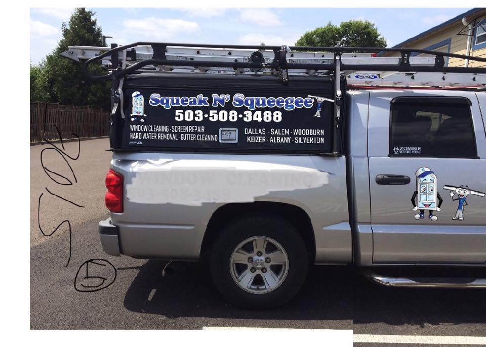
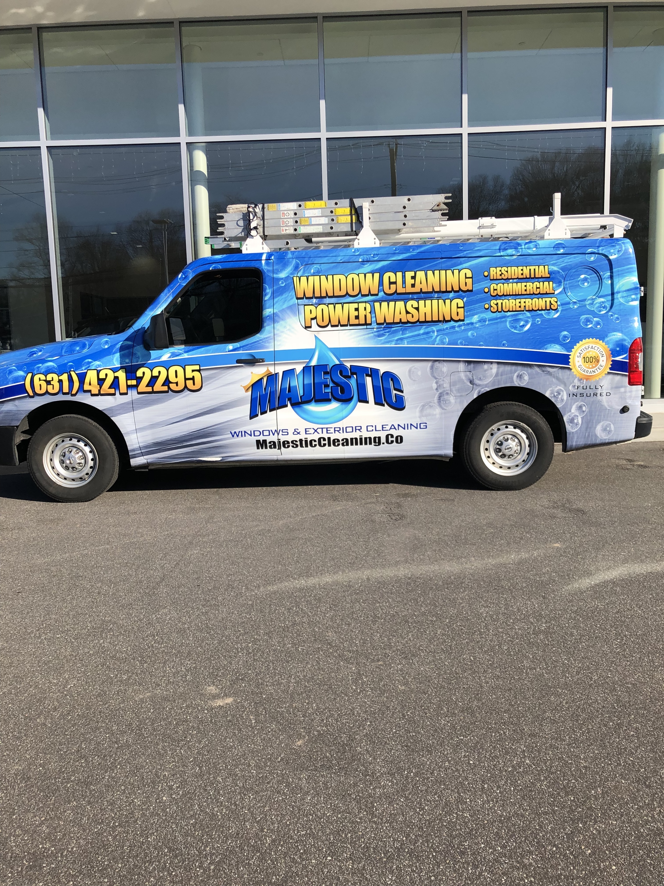
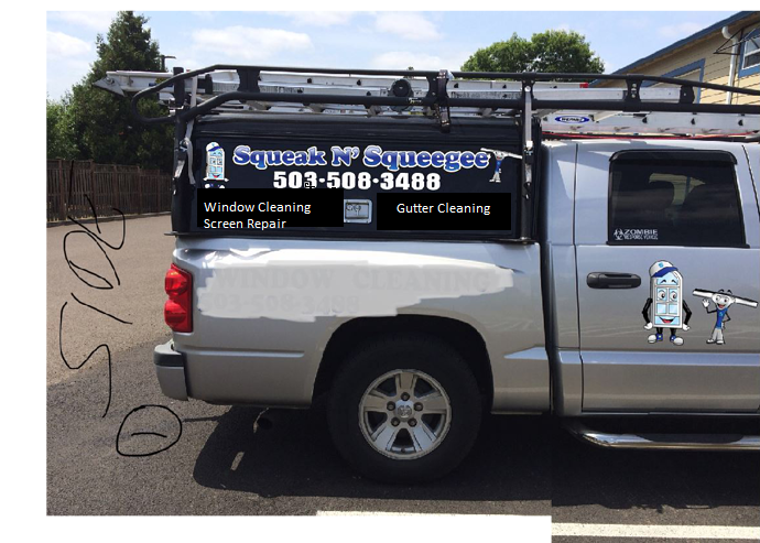
Hey everyone, i hope everything is going well. I have been finishing up the final touches on my update to our brand. Not changing anything just doing a major update. I need opinions on my trucks decals.
Which option?
Hey everyone, i hope everything is going well. I have been finishing up the final touches on my update to our brand. Not changing anything just doing a major update. I need opinions on my trucks decals.
Which option?
Less is more
Just as an example! See you cleaner it is, and the potential interested party won’t be overwhelmed and actually attracted to it as opposed to clutter
Take your squeak N’ squeegee font and use this for these letters
Thanks for your information, ill take all of it into consideration of the final product, however, although i agree with what your saying, i don’t feel your images, not appealing at all, and I’m not wanting drive traffic, I’m wanting foot traffic when parking in front of someone’s house.
Apologies, iPad sent before i was finished.
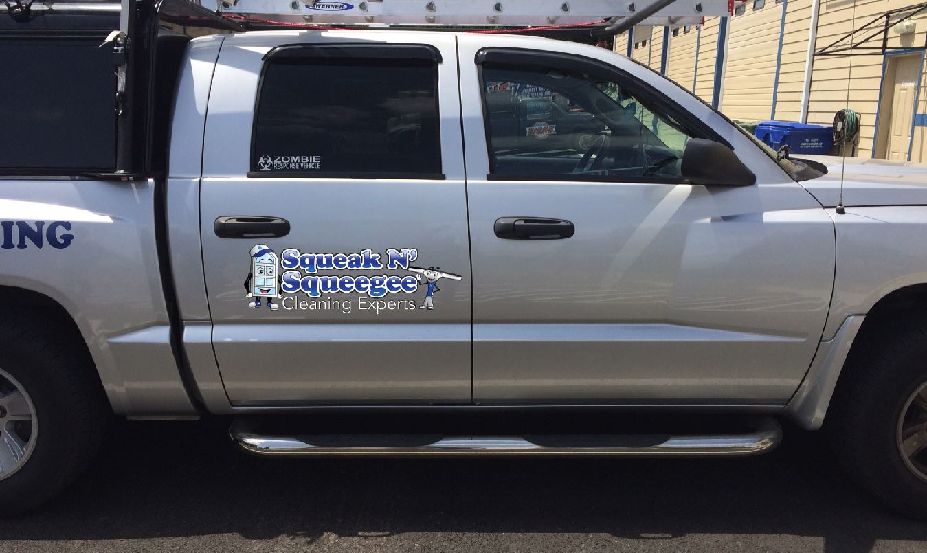
My main reasoning is, in. My area, i have been told by to many neighbors about what type of info they would like to see on service vehicles. So i began to ask my clientele a similiar question. The info you see on my truck is the info they wish every service vehicle had. Most my clients are of an older demographic, a lot of them still think the internet is difficult and don’t want to visit websites. Just like us milinials as society calls us, we want instant gratification, and as do my clients.
They want to know who we are, what we do, where we go, and how to contact us. Next follows my branding. I truly feel i accomplished that without being my typical overwhelmingess. I just wasn’t sure which of the creations was better. I’m also going to show these to my clients and get their opinions.
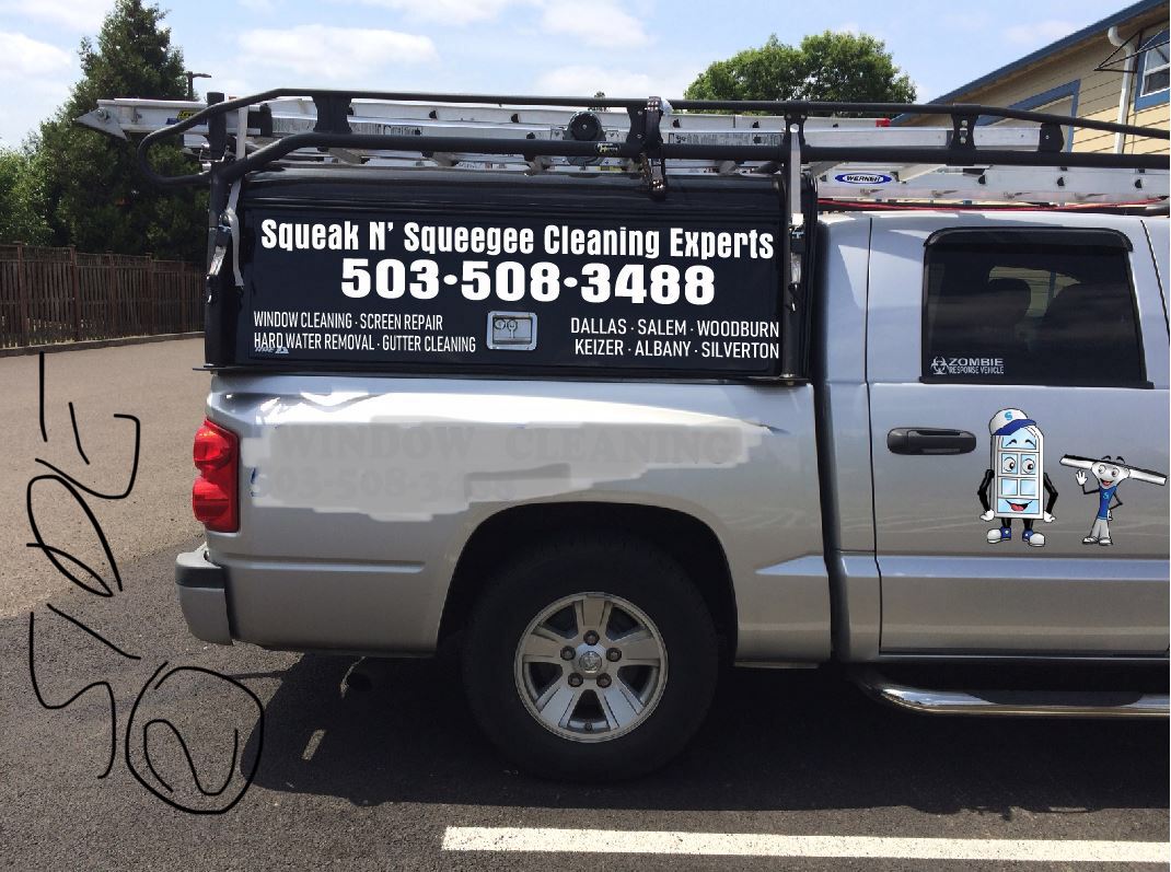
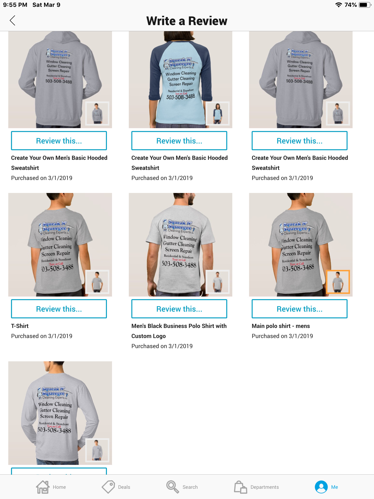
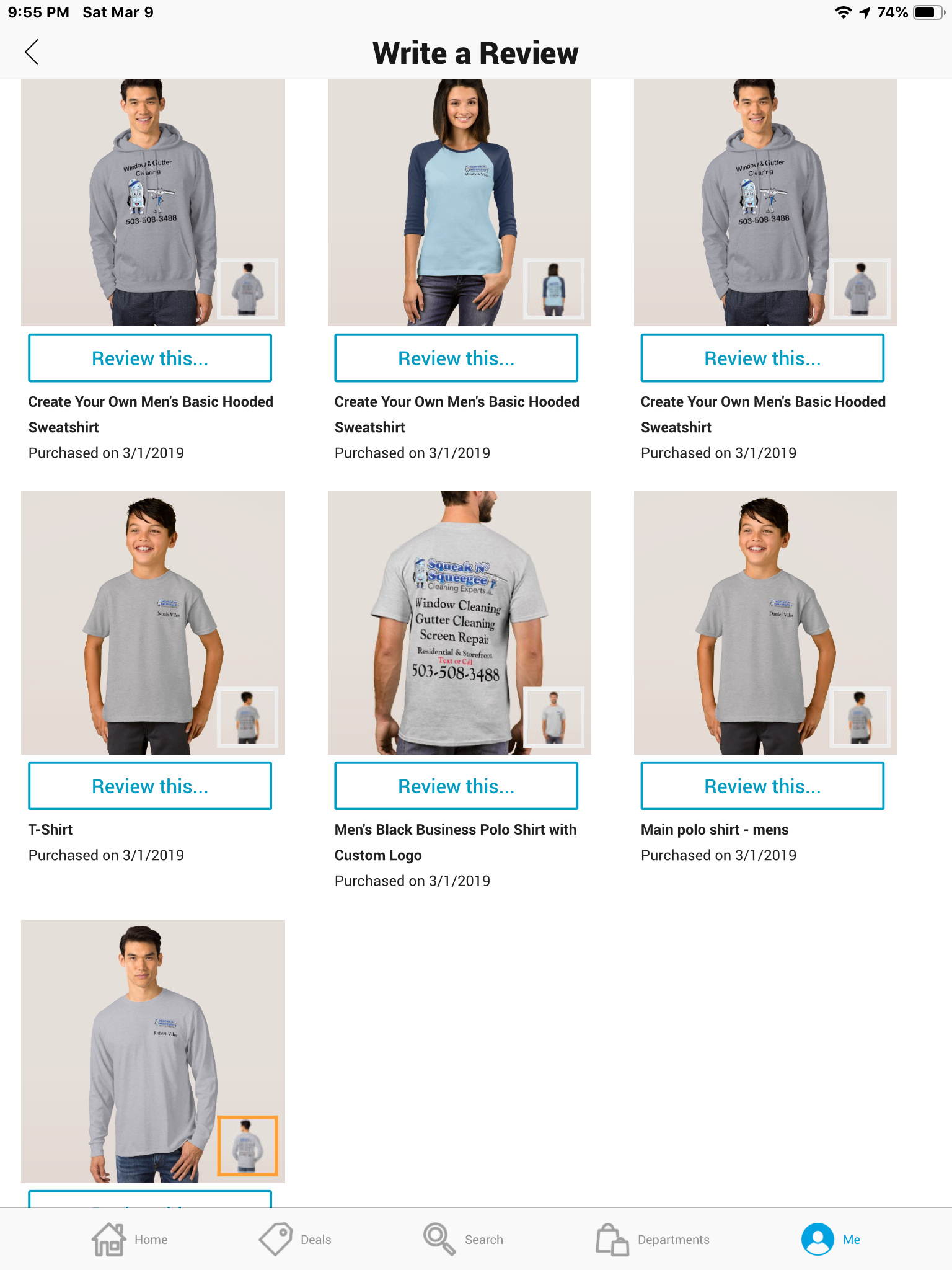
Here’s my new shirts/uniforms.
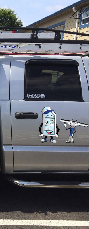
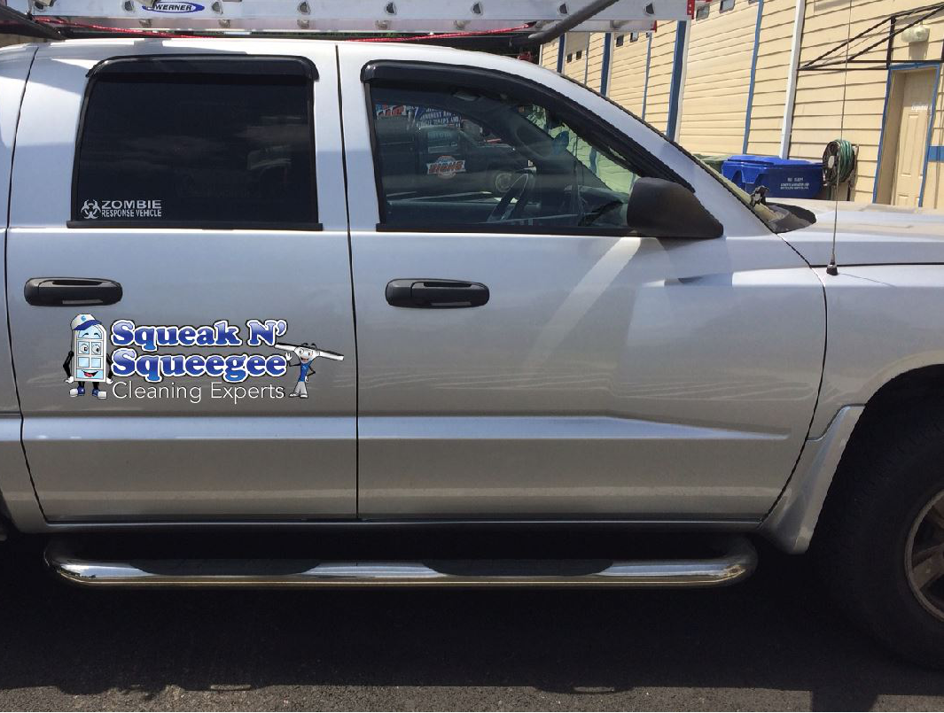
I like the logo because that is you, your branding, it pops and just looks clean and classy. It’s as if you have to read that and can see it without it getting lost or looking like all the other lettering.
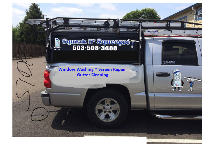
I don’t think you need to list everything you do.
Window Cleaning
Gutter cleaning
Screen repair
Www.SqueekNsqueege.com
Have your phone number big
Your logo a decent size it can be smaller though.
Your website somewhere small - Meduum
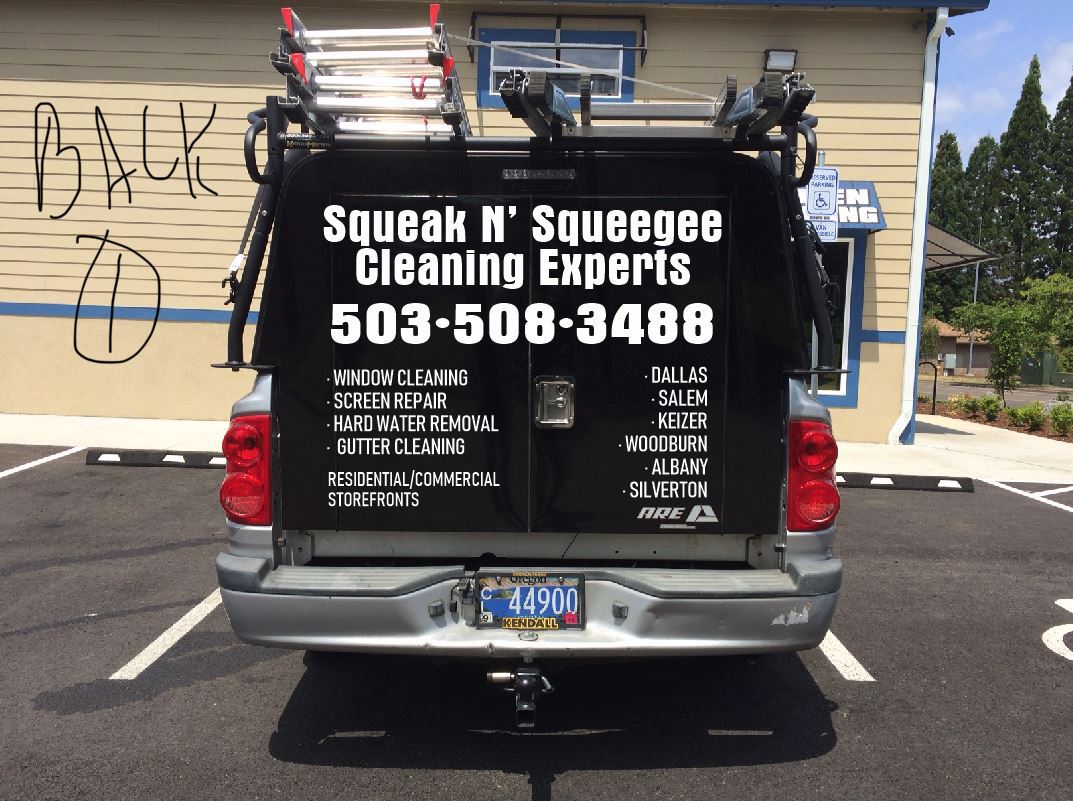
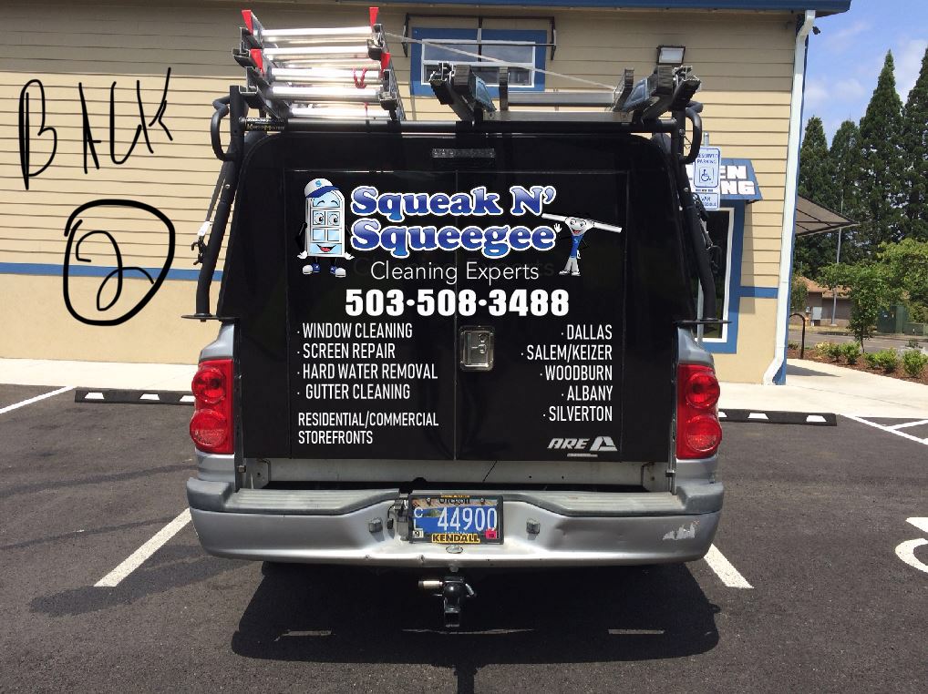
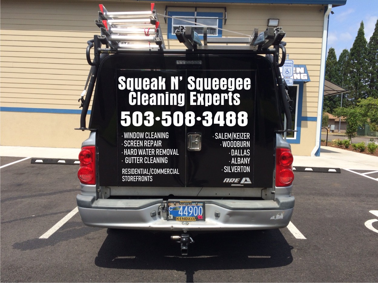
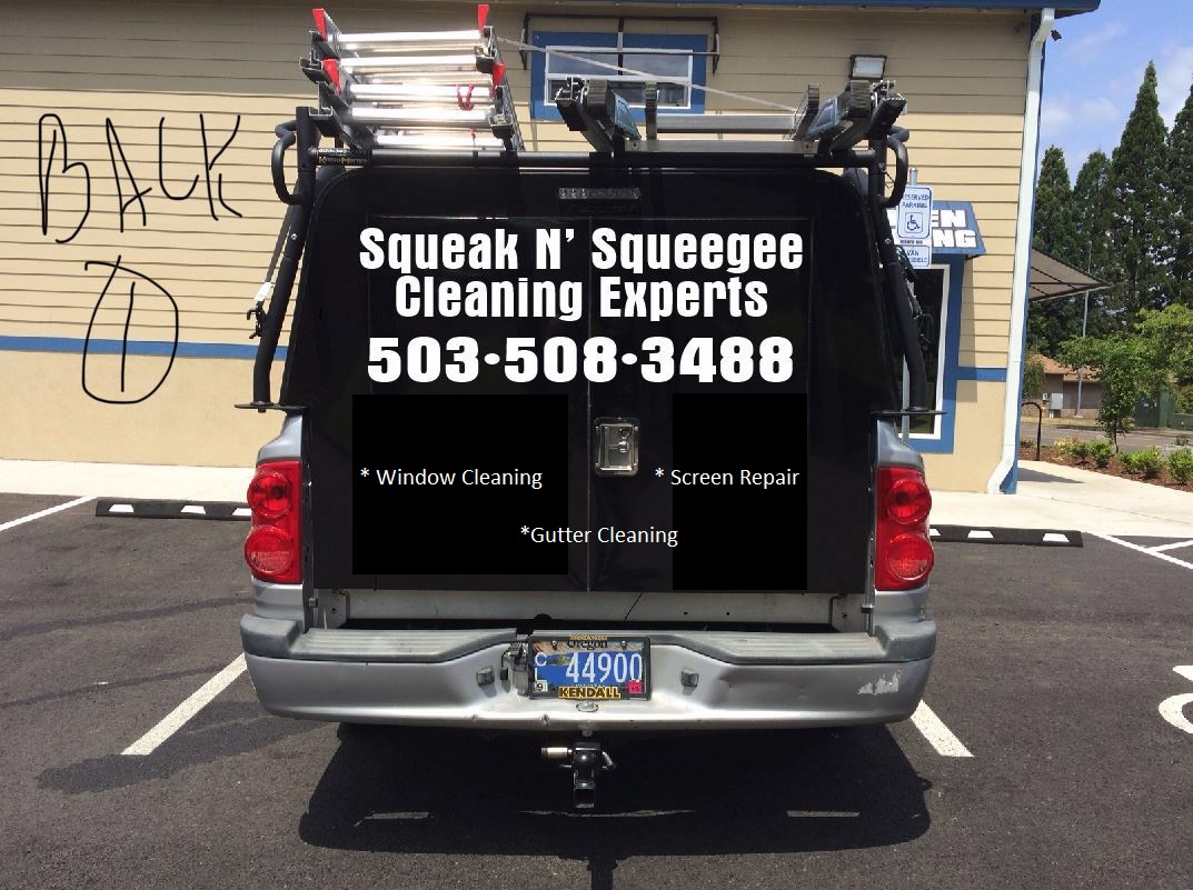
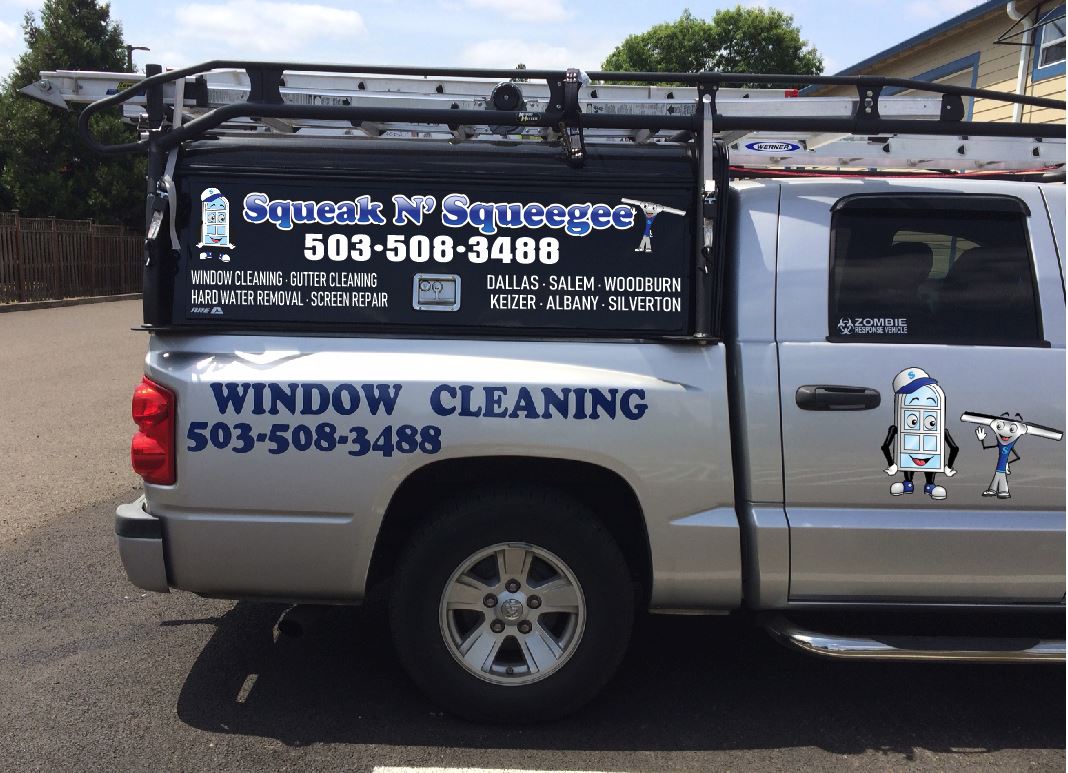
Here is my van nit the greatest but serves its purpose.
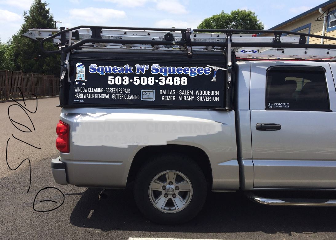
Looks pretty good! I would consider trimming out the service areas.
I like this right here. I would get rid of the service areas.
An underneath phone number
Residential. Commercial Storefronts
Windiw Cleaning
Gutter cleaning
Screen repair.
An you can make the services bigger when you get rid of services areas
But as is works. Lol.
BTW I like your logo. I almost went that way with a window guy
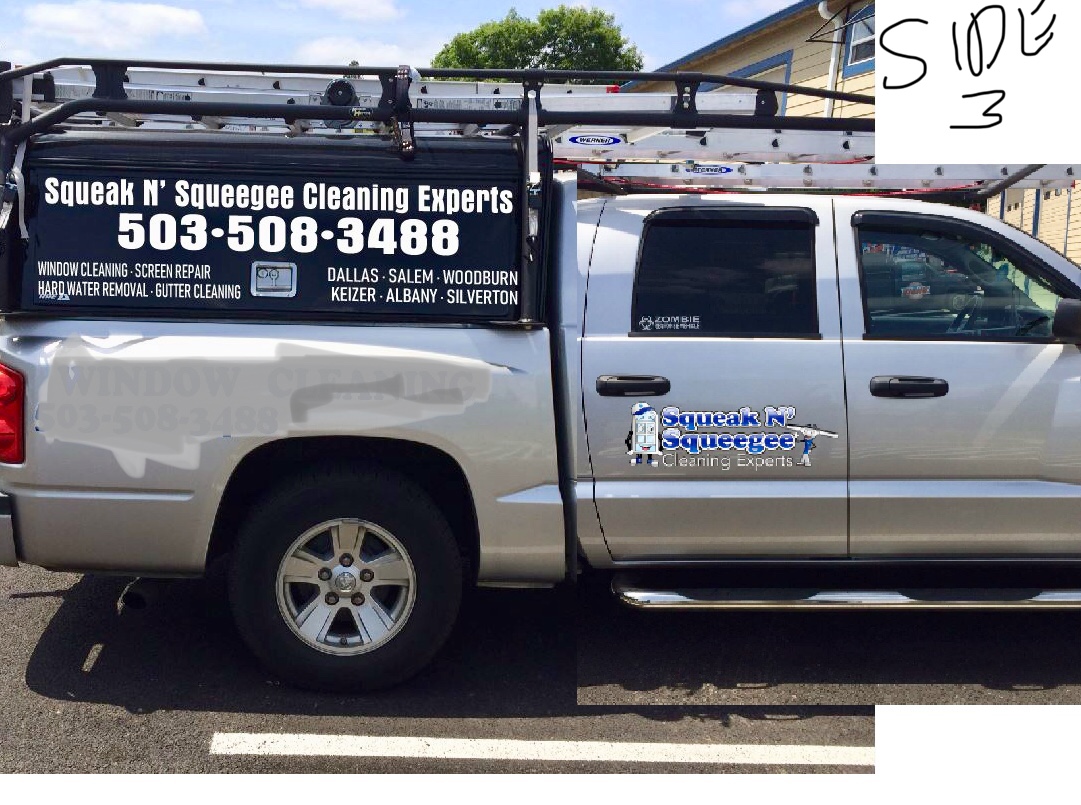
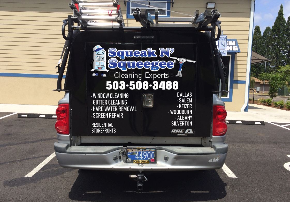
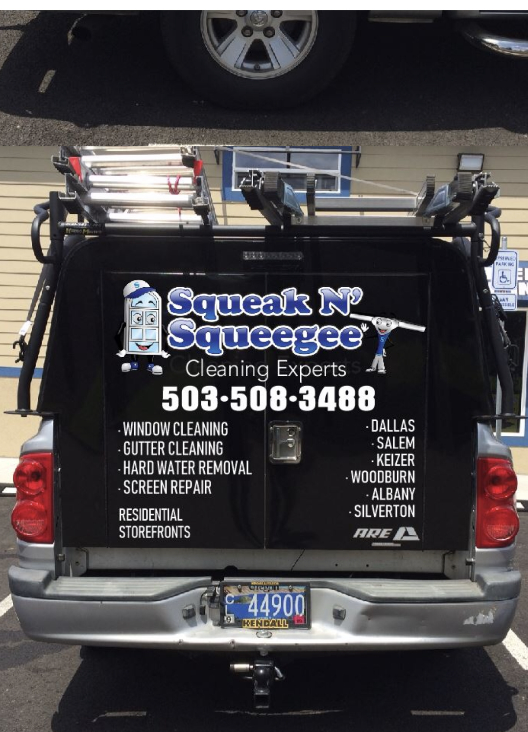
On the side door do your logo same way you have it on the back. With name ![]()
If you took out everything below the phone number and added “Window” before Cleaning Experts, it would say it all. Actually looks pretty sharp from the phone number up.
What is a Residential Storefront ? some might ask.
Separate With Bullet Point over and under or side by side. I like the black and blue. Unique !