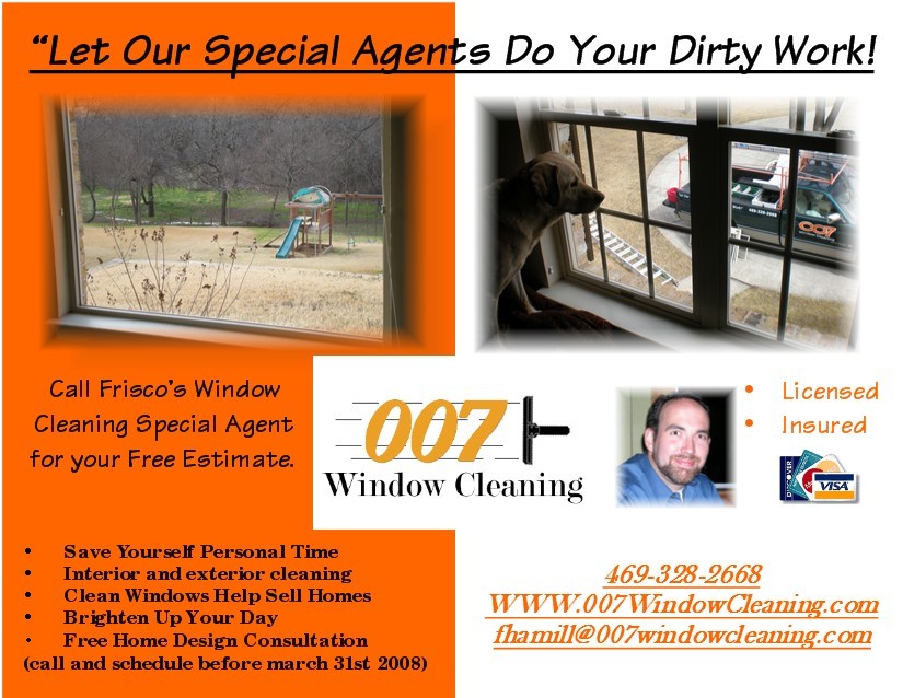
A picture of your lettered truck outside a nice home with a circle drive would look better than the view with the swing set outside. Photos are too square and sharp around the edges. looks a little cut and pasted. Need to soften the edges and add a little drop shadow behind them. if you need fonts, go to www.dafont.com . They are free. download- unzip them and install in your font folder. Violia!
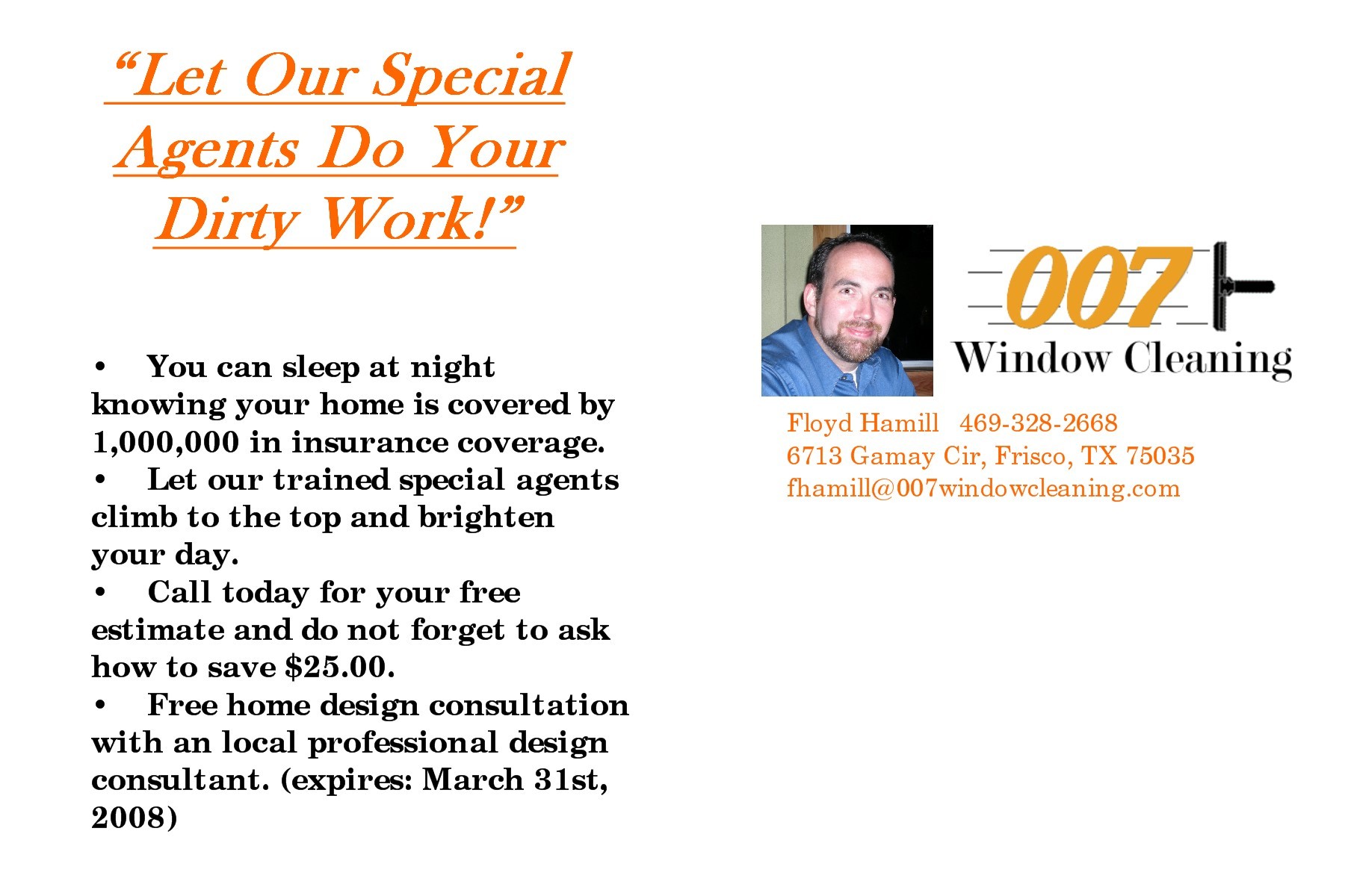
After taking some advise given here. I have made some changes and designed a simple back of the card. Hopefully I have improved it.
As for the pictures on the front i am looking through my files trying to find on. I will be taking more pictures on monday and try and get the truck from the window better. and maybe a picture like beautiful view.
I softened the lines around the picture
changed the catch phrase
added more benefits to the back
Your on the right track but you really need to consider how you are wording things…
I can sleep at night because you have $1,000,000 in coverage or I do???
Your special agents are climbing to the top of what to brighten my day???
offer the $25.00 savings by getting the free estimate for example when we come out to do your free estimate receive a coupon or whatever for 25.00 off your 1st window cleaning or something to that affect. People want to know exactly what and how they are saving before they call, they don’t want to ask how to save.Maybe save $25.00 by calling before March 31st.
Whats with the free home design consultation??? Are you also marketing for another company?
I see what your saying on the wording. Thank you i will revise again.
as for the 25.00 savings it was for a referral that books on the same day. I was thinking it would get people to call for the details on it. Once I get a person on the phone I close about 95%.
As for the Home Design I have a friend that I am trying to help out and she is offering the consultation for my clients for free. The normal cost is about 75.00 for an hour. Bad Idea?
The $25.00 savings idea, if that works for you great!! You know what works better than anyone else. As for the design consultation thing…Yes I do think that it is a bad idea. Especially since these are potential customers. When you do get these people as customers maybe you could offer a home design consultation to them when your collecting YOUR check!!! I think first and foremost you should focus on getting these people to be YOUR customers and trust you and give referrals etc. after that point to help your friend out.
The font used was ‘Georgia’. And yes I covered the the old text with a block of orange. Also notice that the web url in mine is all lower case. Yours has the first WWW in upper case and the “windowcleaning.com” in lower case. Stick to one or the other, not mixed.
If I may comment on the photos you’re using - what are you hoping to accomplish with them?
The dog looking out the window, for example? What’s your agenda behind that?
Or the photo on the left? What purpose is its inclusion serving?
[SIZE=“5”]Think carefully about image selection.[/SIZE]
What you want to do ultimately is choose imagery that pushes emotional buttons.
Your headline speaks of “you doing the dirty work”, yet the images don’t really connect with that, or with the benefit that comes to them from you doing their dirty work…know what I mean?
Have you reviewed those 11 design principles? There are still a few more things you could do to tweak it and make it even more effective!
Your postcard is improving.
Kudos for actually implementing suggestions from members here!
-kill the orange (I would use a light green, maybe a soft yellow)
don’t use a pic of yourself unless it has purpose (a guarantee in quotations next to it is ideal “You will be totally satisfied with your window cleaning- Floyd Hamil”)
-DO NOT add any weird “home design” thing. It is really hard to understand and it is VERY hard to get people to take action on your service, let alone another.
-kill the “special agents” (although kinda cute relating it to your company name, cute sells nothing and they may think you mean a solvent)
-[B]all[/B] of your bullet points are un-meaningful and need to be redone. I really do not even understand what you are implying with some of them.
Your first bullet about the insurance does nothing, your “agent” bullet says nothing, your “offer” is VERY uninteresting and will get you 0 response, the “design” bullet has nothing to do with anything.
I would scrap the entire design. YOU MUST have an offer, getting new customers costs money. You need a money off or a free “add on”, not some “contact us to find out about saving $25”
Would this postcard get you to the phone? If you are going for high end prospects, this card would fail horribly.
Last year I made a beautiful card, a really good offer and still only had 2 phone calls… I mailed 1100. Yet I make fliers and get a 3% response (that would equal 33 for every 1100) Why did the card bomb? several reasons, but the main reason is I did not put enough emotional triggers in the text and on a 4x6 card.
That is the beauty of oversized cards, more room to persuade them to call.
I hate using less than 200 words… but [B]all[/B] the words need to have a purpose.
Take a look at the different comments and rate each one for yourself. Different things appeal to different people. Take a look at what Mike did up for you and then go and read this link.
Guys thinks for all the help. I do have an updated flyer that I think is almost ready to mail we will see. I will post it soon. I would have had it up but I have been in the hospital the entire last week. hope to be washing windows again in a week or too.
I don’t like to use lots of wording. The times i have used lots of wording have gotten me nowhere, very little response. You personally have to judge what may work best in your area. Try and try again, that is how you learn.
If you want some hints on emotional triggers, visit this website. Some good info here: http://www.themarketingbiz.com/copywriting/05022093.htm
Btw, CFP,
You left out the 20 exterior windows cleaned for $79.00! Oh I gotta go, my business phone is ringing!