My name is J. Campbell and I am the owner of a window cleaning start up (Window Clear Pro). I have a new website (http://windowclearpro.com). I have acquired a couple corporate window cleaning clients already, through my website. However I would like some feedback on the site so I can hopefully improve it, and make it better. Thank you in advance for any suggestions or feedback.
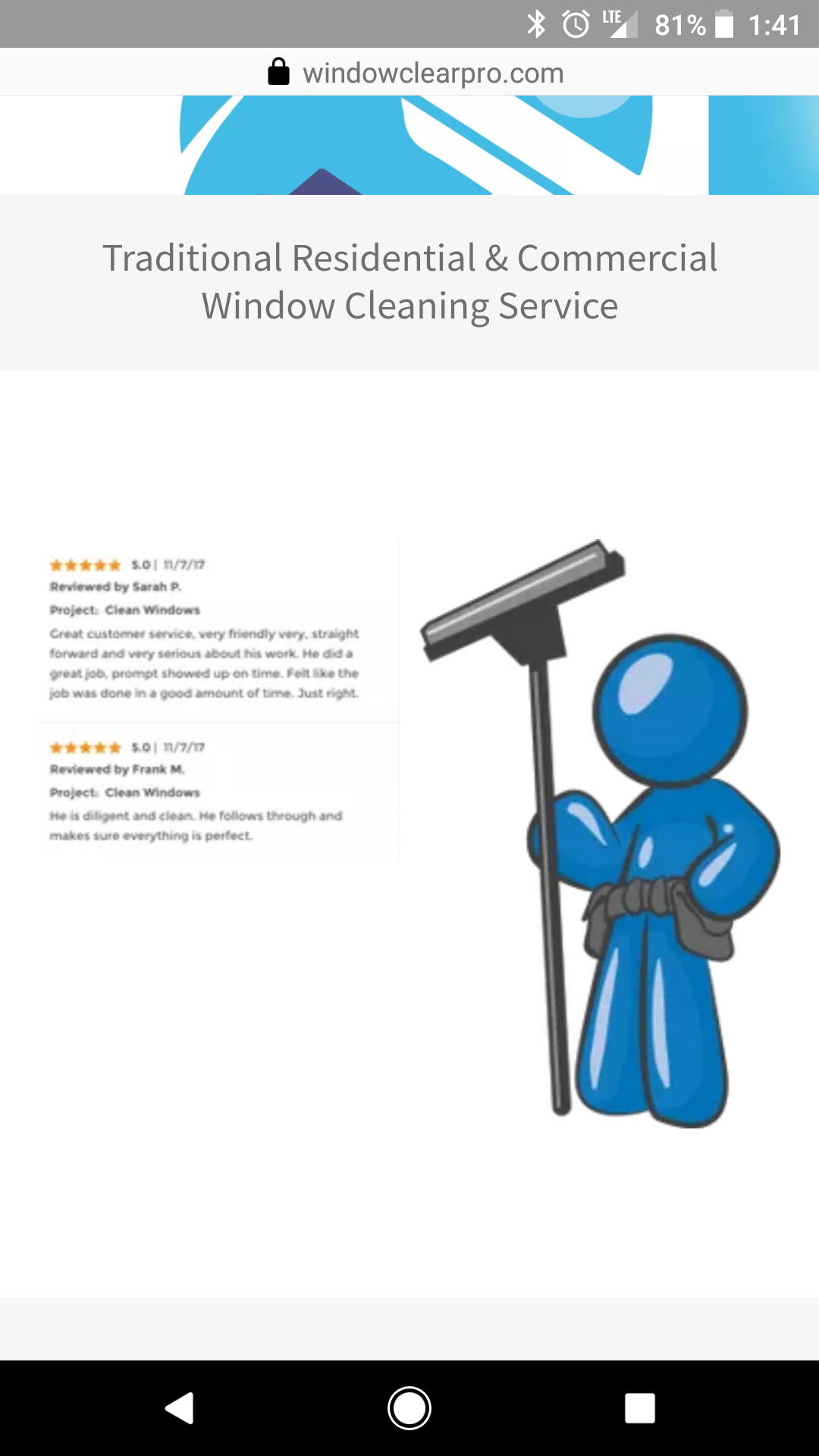
Make the phone number bigger and get rid of the cartoon man and instead put a photo of you cleaning a window or a house that you have done or something. Too much clip art going on there.
Thank you for the feedback. Will do!
Javanie Campbell
Owner, Window Clear Pro
Po Box 653 Seneca Falls, NY, 13148
Phone: (781) 715 - 4235
Yep…ditto on all that…
Also ditch the word “traditional”… if you are using it to make a distinction between wfp work, most people don’t even know what a wfp is…
Be more specific about your location rather than just ’ Finger Lakes".
In your biggest paragraph you could drop “residential and commercial” and substitute customers or clients for “business or home owners”.
The section on encouraging customers to meet the techs is confusing…
And put up more reviews if you have them…
@j.campbell I took a look at the website again. You made some great changes.
I’m thinking the area you service section should be down towards the footer. To me its too long to scroll to the bottom and people may stop scrolling and not see those photos of your satisfied clients.
You could add a page where you display work photos (add info to them like neighborhood, type of service, etc.), people love that.
Maybe also move that home advisor logo up towards the top too. While most window cleaning companies don’t like home advisor that badging is a trust logo that would give a person some confidence to hire you.
That’s my two cents for now. Any other thoughts @Chris @JaredAI?
