Okay everyone, since there seems to be a massive conversation on NEGATIVE and POSITIVE feelings, i felt this a great time to get some honest opinions on my self built website… Okay other then saying go WordPress (Which I will fully integrate eventually) Or saying go buy my own domain (In the works) I just want opinions on the actually CONTENT, LAYOUT, DESIGN, STYLE, COLORS, FONTS, IDEAS. Things like that!
I want both your NEGATIVE -
(Don’t just say, you site looks like crap, and no one will visit it)
and I want your POSITIVE -
(Don’t just saying, hey looks great keep up the great work!)
I want details like
NEGATIVE -
The layout is all wrong, it will confuse your customers.
Your about us page lacks so much detail and style, try adding some more background history.
or
POSITIVE -
Dude your blog is just amazing, every time you add a new post google gets updated and you get more internet space!
You have made it very easy for customers to find every section of your website…
Thanks for anything any of you can extend to my direction!! Im going to go redo my equipment storage ideas while i drool over my gift im buying in march-April.
After finding your site, I have three pieces of feedback:
1 Change the background. It interferes with the words.
2 Get rid of/move the youtube/company character that is at the top of many pages. It is over your wording. Looks bad.
3 Add pictures of you and your staff. The cartoon makes it look like you take no pride in yourself or your people.
Bonus tip:
Your blog shouldn’t be page one (landing page). It should be a quick introduction to who your company is and what you do.
You may also want to consider getting hooked up with square OR getting a paypal CC reader. I don’t think a lot of people will want to pay you AHEAD of the cleaning with CC.
There is more feedback I could offer, but time is short and other guys will throw in their two cents too.
The landing page shouldn’t be the blog. Probably services.
If you like that background make your content body a solid color. Preferable white or off white. Some pages have content color others don’t. I personally wouldn’t use that background, unless I was selling pool services.
Change your font to something readable. There’s a ton of google fonts use one of those. Preferably in the Arial or Helvetica family. But do NOT mix fonts between pages. That’s super annoying. Oh and make the font big - older people don’t want to squint.
Replace the window and safety razor with a google map on the contact page.
Ditch the mailing list.
Ditch the youtube thing in the middle of the page.
Overall, it’s not a bad webpage for the early 2000’s. People today expect clean, simple, and soothing.
Hey bro I have a website with wix too. I’ll integrate with WordPress and update everything come spring. It’s not great like most companies but it still gets calls for now.
www.glassmd.ca
I agree with the blog. Put that on a separate page but i like the blog. Good touch! Keep it all clean and one to two colours.
“Squeaknsqueegee” blends in too much with the blue background - hard to read.
Not sure I like the bubbles and water.
The you tube link is very annoying - gets in the way of text I want to read.
The link in your post took me right to your blog page - if I were a potential customer I would want to go to your “services” page. Or perhaps the “about us” page.
I like your blog page, it is set up nicely and catches the eye.
What’s the "donate"button?
Put your photo on contact page (or on staff page if you don’t have staff) instead of cartoon - that could go in the blog.
I like the review page set up with social media links.
On the “about us” page, say something about Robert and Scott.
I like the details about bonding and insurance.
“Chat with us” is a nice feature as long as someone is always there to chat. If I’m clicking chat on a website I don’t want to wait - or tell me that no one is available now.
Awesome guys, these have been amazing feedback. I will Integrate some of the changes here shortly. I had suspicion of a lot of the above complaints, but needed another push to sway my decision!
Rushing out the door to take family to Wunderland and Carousel! Yay go family time!
@anon82274079
After finding your site, I have three pieces of feedback:
1 Change the background. It interferes with the words.
Changed: what do you think?
2 Get rid of/move the youtube/company character that is at the top of many pages. It is over your wording. Looks bad.
Fixed: Sorry it was hidden on my side due to pop up blocker lol
3 Add pictures of you and your staff. The cartoon makes it look like you take no pride in yourself or your people.
Added: Great idea I have been meaning to update that page dramatically.
4 Bonus tip: Your blog shouldn’t be page one (landing page). It should be a quick introduction to who your company is and what you do.
Switched: I had it set as a welcome page, but took away a lot of stuff from that page and then took it away completely. I will use my about us page until i write a better welcome message/ Intro
5: You may also want to consider getting hooked up with square OR getting a PayPal CC reader. I don’t think a lot of people will want to pay you AHEAD of the cleaning with CC.
Deleted/ re-written : Wow good catch, that was some old mumbo jumbo i had written a long time ago, and copied over from a hidden page. Thanks for catching that, made me look stupid written two different ways.
There is more feedback I could offer, but time is short and other guys will throw in their two cents too.
The landing page shouldn’t be the blog. Probably services.
Switched: I had it set as a welcome page, but took away a lot of stuff from that page and then took it away completely. I will use my about us page until i write a better welcome message/ Intro
If you like that background make your content body a solid color. Preferable white or off white. Some pages have content color others don’t. I personally wouldn’t use that background, unless I was selling pool services.
Changed: Great Idea, I decided to do this to all my pages for a while and see how it turns out!
Change your font to something readable. There’s a ton of google fonts use one of those. Preferably in the Arial or Helvetica family. But do NOT mix fonts between pages. That’s super annoying. Oh and make the font big - older people don’t want to squint.
Changed: Awesome observation, I have changed all the pages to match Ariel and Black writing and am matching sizes as necessary.
Replace the window and safety razor with a google map on the contact page.
uhh? Insulted? lol: This is my drawing of my characters/kids Squeak (the window) and Squeegee (the squeegee)… ?? A Safety razor? lol That is a brass Ettore with a rubber coating of my company colors.
Ditch the mailing list.
You didn’t mention exactly why?
Ditch the youtube thing in the middle of the page.
Deleted : Oops my bad, my ad blocker blocked me from seeing this!
Overall, it’s not a bad webpage for the early 2000’s. People today expect clean, simple, and soothing.
Well considering it has been since the 2000’s since i last made a website i can’t be too insulted, but damn! I thought this was simple, yet a bit update. I will see what I can do about the background. I am never EVER happy with my backgrounds. EVER!
“Squeaknsqueegee” blends in too much with the blue background - hard to read.
Changed: Made it a different color, I always questioned that myself, but my wife said it was “ok”
Not sure I like the bubbles and water.
Fixed/Mostly: Take a look and see what I did different, tell me if that make sit better for you.
The you tube link is very annoying - gets in the way of text I want to read.
Deleted: My ad blocker was blocking me from even knowing that was there.
The link in your post took me right to your blog page - if I were a potential customer I would want to go to your “services” page. Or perhaps the “about us” page.
Changed: All of us agree thank you for noticing this! I have Now fixed this!
I like your blog page, it is set up nicely and catches the eye.
Thank you, and I’m trying to keep things relevant, next im doing a blog on How often you should get windows cleaned, and Why.
What’s the "donate"button?
Put your photo on contact page (or on staff page if you don’t have staff) instead of cartoon - that could go in the blog.
Pending: I have to come up with some Ideas on this, change pending. Thanks
I like the review page set up with social media links.
Thank you, I have updated this section, go look!
On the “about us” page, say something about Robert and Scott.
There is no Scott, Sorry for the confusion. I have updated this page. I am Robert, I opened the business with a “PARTNER” and he was never around and I paid for all start up cost. Thank fully I had many legal documents in place to cover such actions.
I like the details about bonding and insurance.
THANK YOU! I did so much research on this subject and talked with so many companies on this! Finally got a company to at least allow me to quote them.
“Chat with us” is a nice feature as long as someone is always there to chat. If I’m clicking chat on a website I don’t want to wait - or tell me that no one is available now.
This is always sent to my phone just like a text message. Just another way for customers to instantly reach me out in the field until I get a office person.
Your HOME page needs to give basic information about your company, something that can be easily read in under 20 seconds (the average time spent on a webpage). Think about what your potential customer is going to look at based on sites you might use.
Get rid of the family photos (silly and unprofessional) use pics of your jobs.
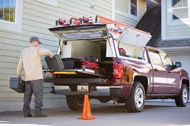
Nobody cares about your WFP set-up and all those pics, it’s pretty meaningless to your customers. Doesn’t look good with all those parts and tools laying all over the place. LOL Make a youtube video or pictures of the WFP in action. Think of it this way, if you were buying a car you could care less if they had a picture in the brochure of technicians installing the electrical system or trunk latch.
Not getting rid of the family photos. Main reason being is my wife mikayla is my office staff, and my sons are both window cleaners and my employees. Check out our YouTube videos of him cleaning windows and getting paid.
Other reason is I’m very family oriented business and people in Oregon also way eat that up, but even if they didn’t, I’m here to spread my family owned and operated business
Noted on the front page, still working in that.
The point of a blog is you talk about just about anything and show off new additions to the business. If I was reading a blog on a car technician website I would expect to see pictures and videos of him doing the repairs and showing off his tools… Thank you for your opinion.
So based on this article and 2 hours of constant research
I have come to the conclusion I will remain with wiz but purchase the unlimited plan for now.
They are not hard to build (WordPress sites). They are not hard to change. If I can do it, anyone can do it. Building a site is EASY. Coming up with good marketing copy is the hard part.
It’s only about 100 bucks a year for Linux hosting and a domain.
It’s all done through html and even though I used to do website coding back in late 90s early00s I never enjoyed it.
Wordpress.com does not do the see what you get while seeing what I’m doing… I see all the major benefits for those who use it… but for what I want, need, have time and patients for. That’s a simple GUI that wix currently offers. And their set plans define exactly what I am needing.
When I’m more established and can hire out, it is not worth it to me.
If that was true (you have to code Wordpress) I would never have built a website. I didn’t write the HTML code for my site. I built mine on a Responsive theme. Mine works on PC and mobile platforms. I built a clean site with no fancy backgrounds and no flashy crap. The only thing I had to “code” (copy and paste) was for google for my stats tracking.
I also did all my own SEO. If you read enough articles, I’m sure you will be convinced that mere mortals can’t do their own SEO either, so they will want you to use “X’s” service at a monthly fee.
Over the winter, I am changing my website to include more video. I won’t need to “code” that either.
You can believe whatever you want. I have experience actually building a website with WordPress.