-Lets start with the back ground color …
(to dark) general population like light happy colors. I use white as a background so my info stands out and is easy to read.
(But me i like dark background and white letter…its easier on my eyes)
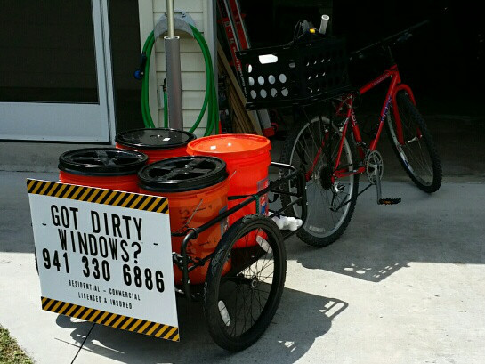
Got dirty windows ™ (really it yours)
first page to many words (from mobile device
Keep it simple to the point customers searching mobile want to the point info and a contact # to reach you now, then they ask questions.
So - - I’m a web designer these days (Used to be a window cleaner) and because of my profession I tend to notice more than most,… please don’t think I’m being overly critical, but my list is probably going to seem longer and harsher than most - apologies in advance.
White text on a black background does work in some situations - if you’re targeting corporate sales or have a high end luxury product its a popular option (Usually with a much thinner & more elegant font),… but it is hard to read especially on some older mobile devices AND it doesn’t convey the clean, bright and airy feel that your business should be promoting. I would COMPLETELY rethink your colours and would recommend a 100% white background with dark grey text. Maybe use a dark bar for the footer and a splash of colour in the header…
The site doesn’t seem to be very well optimised for mobile devices, and with over 50% of internet browsing now don on phones and tablets this is really important to get right. I know Wix has its ways of serving a mobile version of the site, but a framework that is natively responsive to screen size will always give better cross-device compatibility. I’d recommend getting proper hosting (Godaddy do a new SSD Wordpress package which is lighting fast) and install wordpress - buy a professional theme & go from there.
Kinda repeating myself, but move away from WIX. Its easier to get decent Google rankings if you avoid any “website builder” type services. Google seems to give consistently worse rankings to sites built on these platforms.
You need MORE of everything - the internet is a huge desert & even Google has trouble picking out single grains of sand - make your website more visible by adding more content. Google loves fresh, unique, relevant content - so more pages, more testimonials, build a portfolio of recent jobs, write a blog about your business every week. Link your site into social media with a business page on Facebook, profile on Twitter, Google+ etc etc. Get a Google My Business listing, and list your website in every online directory you can find.
Make your branding work for you. At the moment your logo doesn’t say “Cleaning Services” to me at all (I see a dynamite warning label mixed with an illuminatae pyramid!) - something as simple as a new logo will not only make your website look better but it could make your whole marketing plan more effective across the board.
Your on-site SEO is sorely lacking. Your page titles need to be more than just your company name, and the meta description is a valuable asset that isn’t being properly utilised too. Sorting that out and adding some metadata would be easier in Wordpress (Use the Yoast SEO plugin), but still possible if you stick with Wix.
Finally - photos of dirty windows vs clean windows simply don’t sell your services on their own. Before and after shots can be great as part of the overall plan, but the truth is that “people buy from people” - - when you’re building a website you are NOT selling your cleaning services, you are selling YOURSELF as a service provider. Photos of YOU and your team at work are the ones that make the phone ring…
This is very helpful, thank you. I will implement as many of these things as I can. All my advertising money went to the video so it could be a while before I can afford a webmaster for the more complex functions.
The videographer charged me 250 cash, as he is moving to NC a week from now and just wanted to fill a couple days with work. We spent probably about 5 hours together and I don’t know how much time he took for editing by himself.
Not sure your area but if you are in a smaller area you really don’t want to waste your time with SEO. Too unreliable of a traffic source, but good for branding. Video converts up to 300% more than traditional website copy.
You are on the right track. Throw some testimonials on your home page and you will increase your conversions up to 20% more than what you should already be getting.
When putting together your site. Did you start with the end in mind?
Did you decide where and how you were going to drive traffic to the site?
Your video rocks man… Don’t let anyone tell you different.
Also bro… I appreciate your thinking outside the box and using your creative juices to stand out from the crowd. I dig it.
I didn’t have any jobs this morning so instead of walking the beat with door hangers I rolled out V2 of the site. Check it out and keep the feedback coming please =)
Definitely improving - and having the homepage a bit simpler with the video more prominent is good - it is a fantastic video.
On the gallery page I would remove a couple of non-cleaning related pics - the rabbit, pulling faces etc etc, and I’d forget about the links page all together, it has pretty much zero SEO benefit these days.
I want you to look at the amount of text on the About page - and make that your target for EVERY page - - and then I want you to add more pages!
Have a page for residential window cleaning, one for commercial, one for storefront, one for gutter whitening, one for chandelier cleaning etc etc - and make your services the MAIN focus of your navigation menu,… if you run short of space on the menu, have additional info like the About page on a drop-down.
Mention some of the names of the towns and areas you work in on every page - this is important for Google rankings as most people will search for the name of the service they require followed by the name of their town…
Add a dedicated Contact Us page - I know you have a contact form on every page, but a lot of your clients will be older & not great at internetting - make it as obvious as possible.
Add testimonials to each page - showing genuine feedback from happy customers can give ppl that little extra push they need to pick up the phone.
Add a portfolio page & regularly update it with details and photos of recent projects - Google loves this kind of fresh content.
The header looks a bit generic and you may want to invest in a logo to put on site as well as uniforms -vehicles- bumper stickers on equipment. That video is quite simply the best ive ever seen for a residential company- I saw 5 things in a row that would make me hire you for more $ than a competitor: blue shoe covers-towel on sill-shaking hands with homeowner-moving the wooden giraffe and discussion with the homeowner…the slogan about paradise is clever also. Now add some testimonials -list or links to addresses youve serviced (no names)and you are off and running.Also a contact us button.