FWIW: I prefer the one with the sunburst in the V. It is the simplest of the 3 most recent versions. Simple is better. Too many subtle details (reflections, tiny stars, etc.) will be difficult to reproduce when you scale the logo smaller for things like embroidered shirts, pens, etc. You must be sure that your final image will scale well in both directions, larger and smaller.
3 Likes
Plus ∞
something else to consider is the color profile. I found out too late that the color of green in my logo is impossible to get printed on professional cmyk printers. My business cards and signage on our vehicle is a little darker than what you see on screen. Best to design in the CMYK color profile from the get-go if you have the ability to do so.
2 Likes
Tony C is spot on with his “simple is better” approach. All these little embellishments look nice on screen, but usually aren’t practical for the real world. Tiny business cards, big vehicle signs, 2 color t-shirts, etc. all put limitations on logo design. Not to mention, the simpler a design is kept, the more likely it is that it won’t go “out of style” in a few years.
4 Likes

2 Likes
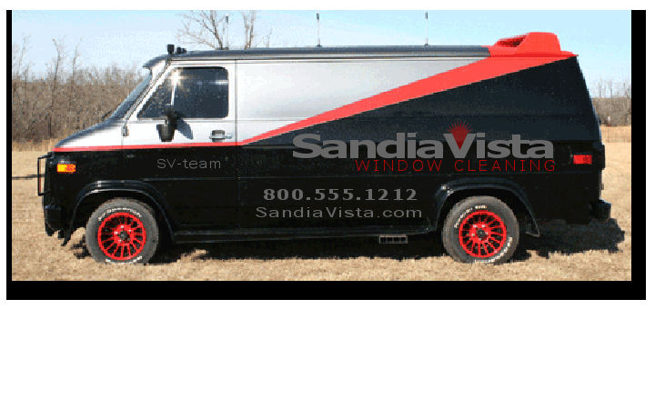
That looks great! I like it. Might go on a black vehicle though.
Can you send me the squeegee graphic? I couldn’t get that result in Inkscape. [email protected]
You guys are great! I really appreciate the interest and the help!
No offense taken. You’re right, much more to focus on.
1 Like

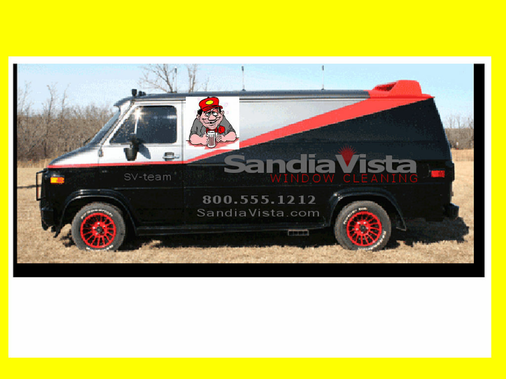
That does look impressive! I really like the simplicity of your design. I could change the color to match the media as well. I like that color on a black vehicle, but I could use blue and yellow on the website and stationary. Hey, thanks for taking the time to put this together and showing me on a vehicle. That really helped!
Ha! There’s already going to be a guy like that in the window! Besides, my customers will have enough to laugh about when they see me on a ladder… and my pole work… and… ![]()
The A-Team van was the best picture of a black van that I could find! 
I’ll dig a a little more and find a picture and use blue and yellow.
What kind of van do have or will be getting?
1 Like
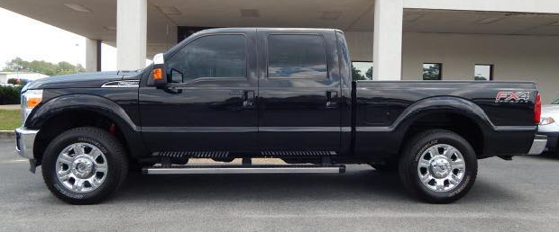
I have a 2015 Tuxedo Black F-250 Crew Cab. This isn’t mine, but it is identical.
Ya I like both that you have done. Sleek an simple. Where were you when I needed you
2 Likes
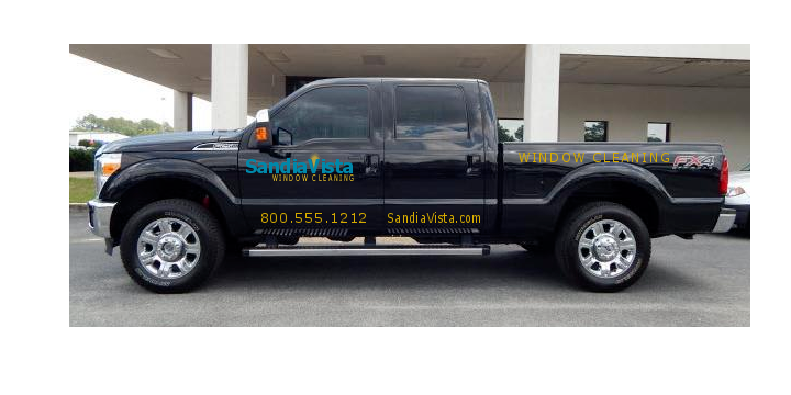
Wow, Patrick. That turned out really nice. And it’s so simple!
@Gotlift I bet this one would allow you to put some stylized mountains in the background if you wanted.
Wow that’s a super nice truck. Black is my favorite color for trucks.
FOCUS! No more add ons! ![]()
Thanks. I love my truck, but black in the high desert has its challenges. Kind of funny though, that truck sort of started this journey. I was looking into a DI Spotless water system to keep it clean. One of my coworkers tells me his friend has one that he uses for window cleaning and he’s the “only game in town” (yeah right! ![]() ). That conversation stuck in my head for a few days so I started looking into window cleaning and the rest is history.
). That conversation stuck in my head for a few days so I started looking into window cleaning and the rest is history.
4 Likes
Nice work Patrick!
1 Like
Awesome truck! I’m sure a sign guy would be able to mock it up way better. Do you plan on leaving the “Fx4”…can that even be taken off?
3 Likes
That does look cool! Tough call on the FX4 decal. I’d like to keep it for resell value, but it would depend on the what the design looks like and if it needs that space. This is getting me fired up! I’m digging your design over mine. Going to send this to my wife.
