That character is similar to @BlueLightning08, the big difference is i can tell what type of service you offer
2 Likes
Ya i wonder where he got the idea from. Infridemnet !! … I want money for that logo Mr Blue lightning lol
2 Likes
That is an awesome logo actually, I am highly Impressed. Although I have been on these forums for years even prior to my business. That is the first time i have seen it. And am jealous, and amazed you didn’t use it, but i also really love what you currently use. I have always had plans on redrawing mine, and now I can’t get yours out of my head. Thanks a lot lol. Now i have to wait even longer till i forget yours…
As for charge, thankfully they don’t charge me extra, once i put something on the back, that’s where it cost extra. The back is where I want the info… As for call to action, I’m still trying to figure out that one, how to add it, without making the back fill even more cluttered. I agree when you guys are saying, get to the point, give direct info and don’t make it a snooze fest.
Feel free to use it if you want. I don’t care. My van is wrapped not going to use it now. If you need the files let me know. I don’t care. You’d have to switch it around a bit to fit you
If ya want I’ll send ya the files.
2 Likes
You don’t need a call to action on a shirt. I really belive it’s not an advertising piece.
Keep your shirts simple. The first one is fine. The front doesn’t have to have anything big Just your logo name of company on top of logo An Window Cleaning on the bottom of it for front. Small on top left arm
JMO .
Keep your shirts simple. The first one is fine. The front doesn’t have to have anything big Just your logo name of company on top of logo An Window Cleaning on the bottom of it for front. Small on top left arm
JMO .
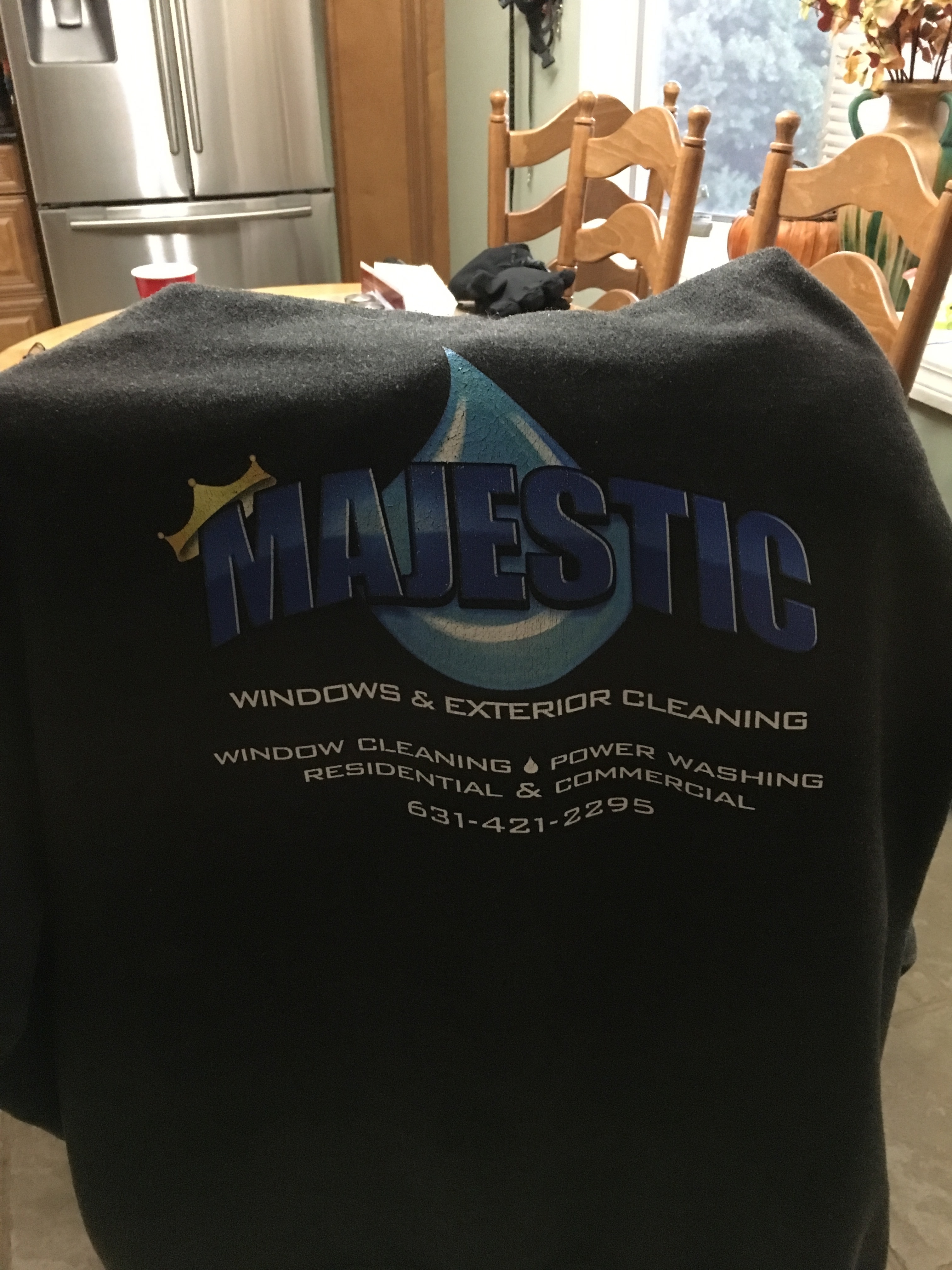
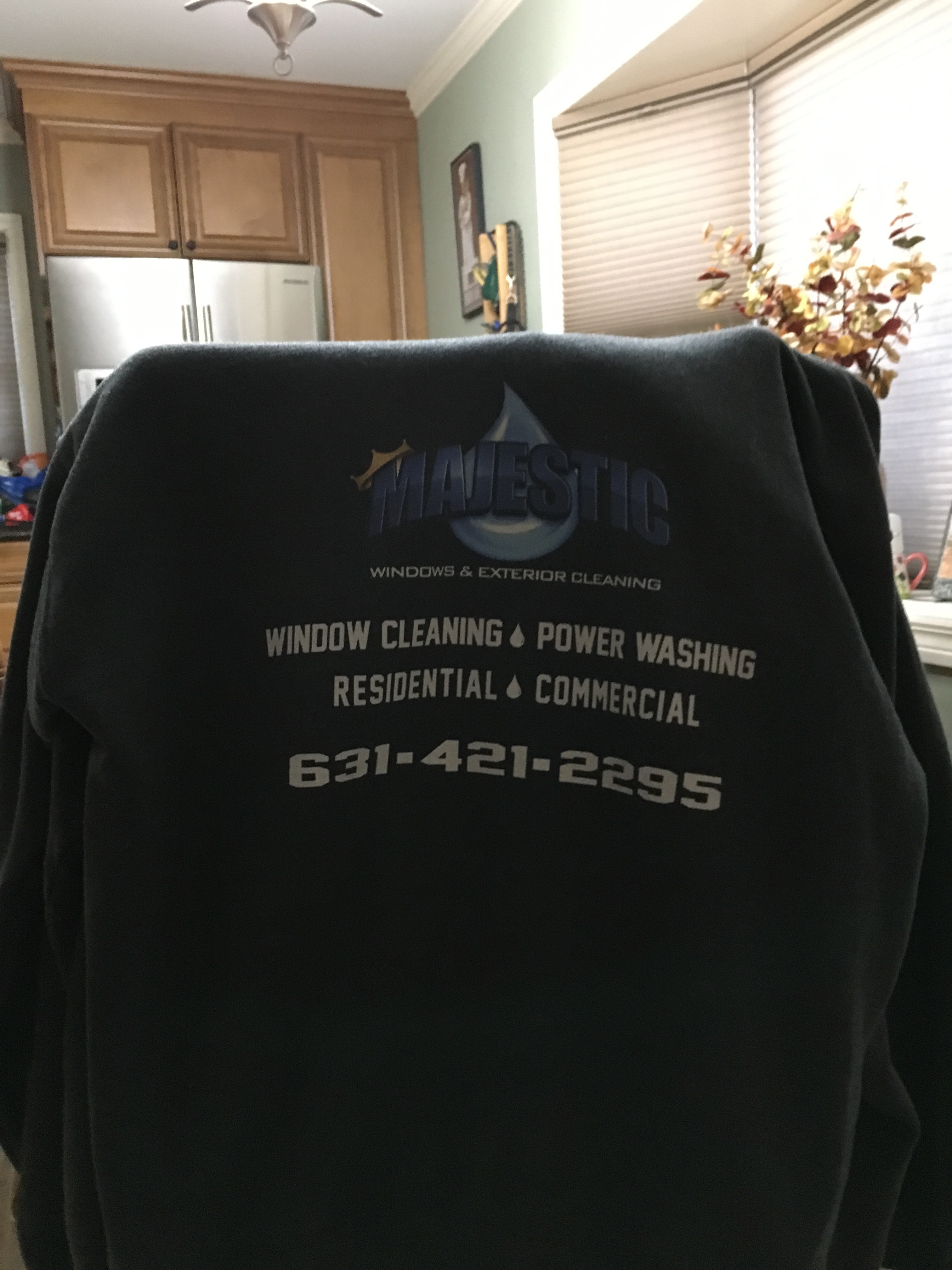
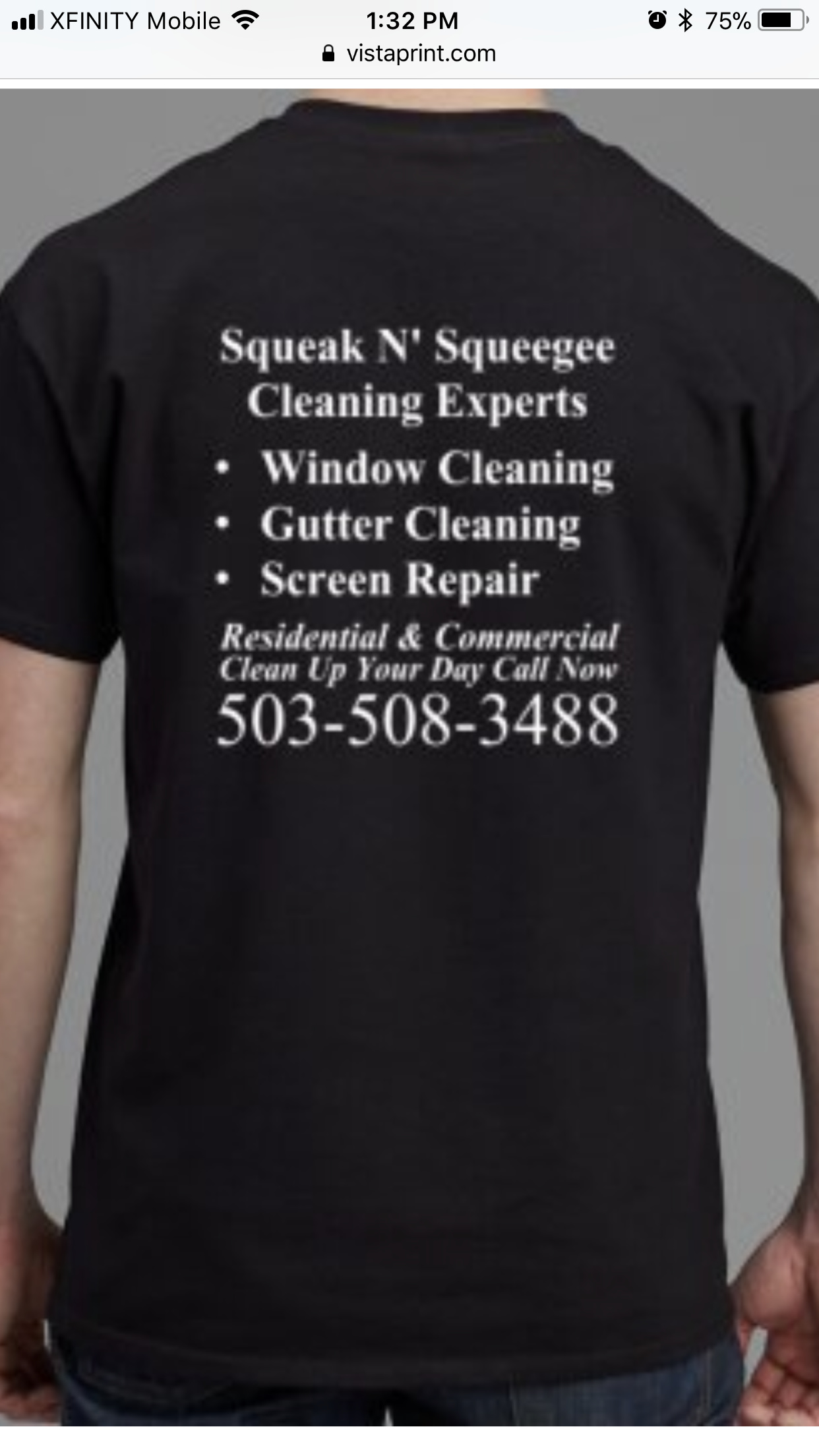
I should of went bigger with phone number & services
But next time no big deal
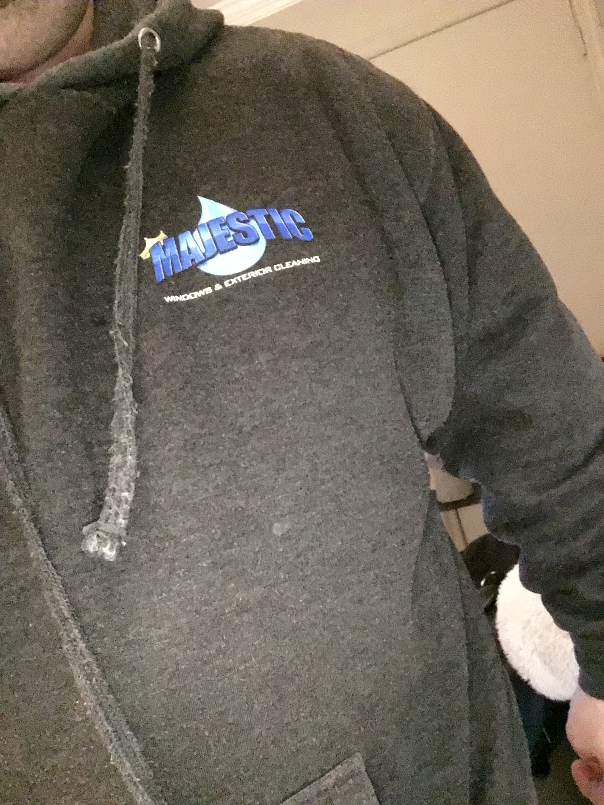
I just remembered I had these spring light sweatshirts done recently
4 Likes
That’s awesome bro.
2 Likes
That is a solid character logo! Extremely well done.
And your offer to Lightning was grand. You sir, deserve nothing but good things.
3 Likes
I like the logo and the lettering in the front like that but now your name looks awkward. Maybe go with no name?
I almost wish I had put my logo and all offset on the back of my shirt. My scrim is covering half of it 90% of the time if I’m on the glass.
I agree , I am amazed he is so willing to give it up. Thank you but no thank you, I’ll just redraw mine with yours in the thought process. Thanks for being a great pal!
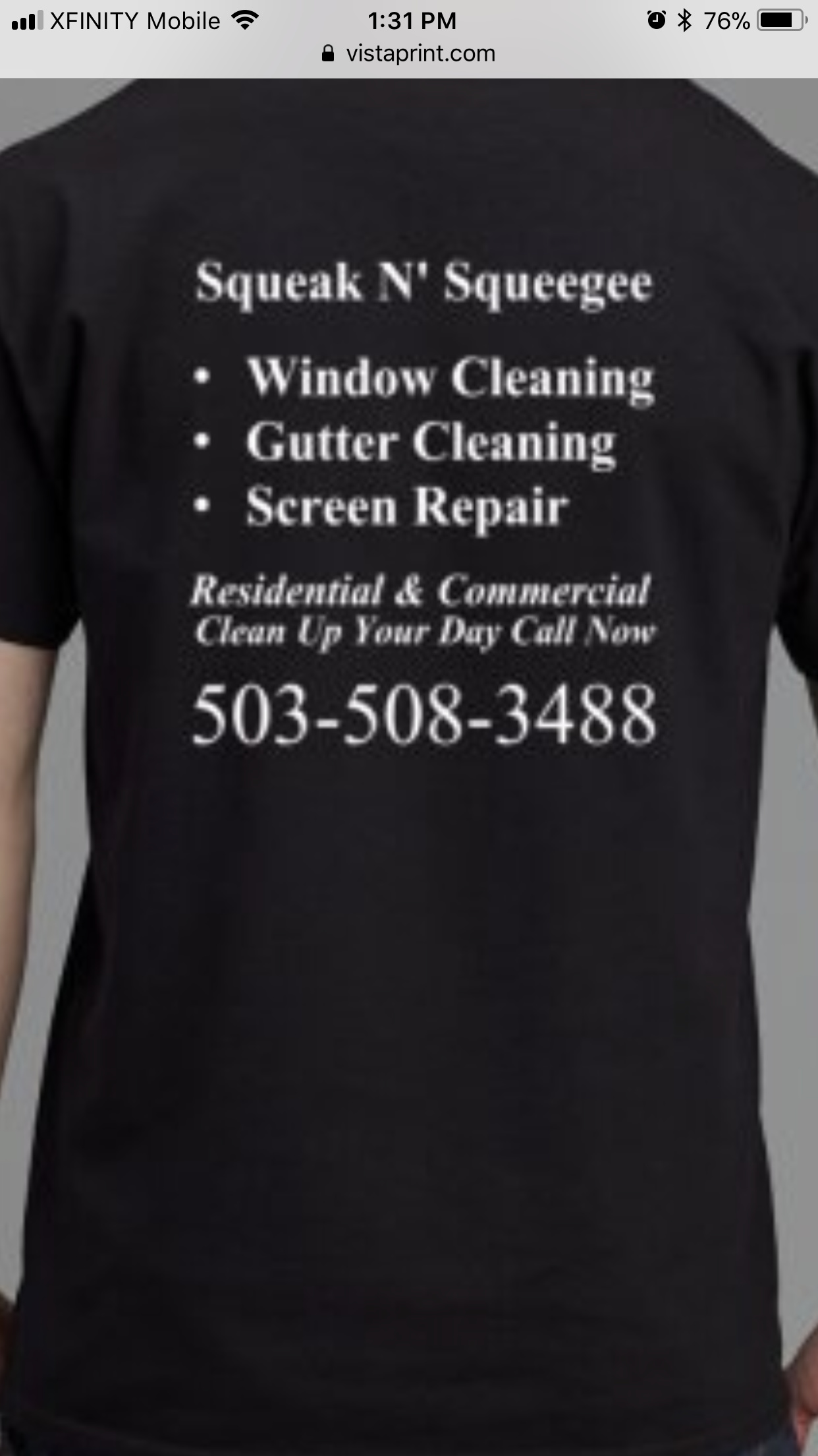
Yeah I been deleting and re adding the name the entire time… let me upload a picture of my original first shirt I dislike…
Now my second I had printed
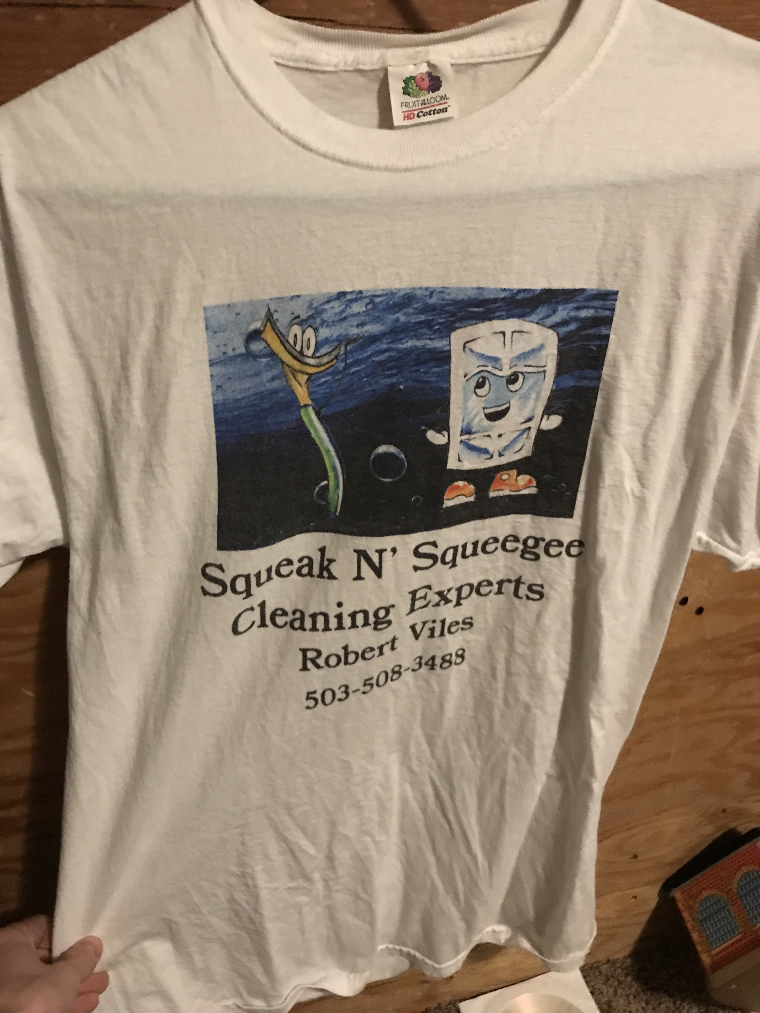
So we must all admit these all look better then my original two?! Lol
1 Like
Lol, yes.
I would go with out the name. It’ll look better and customers will know you by introduction.
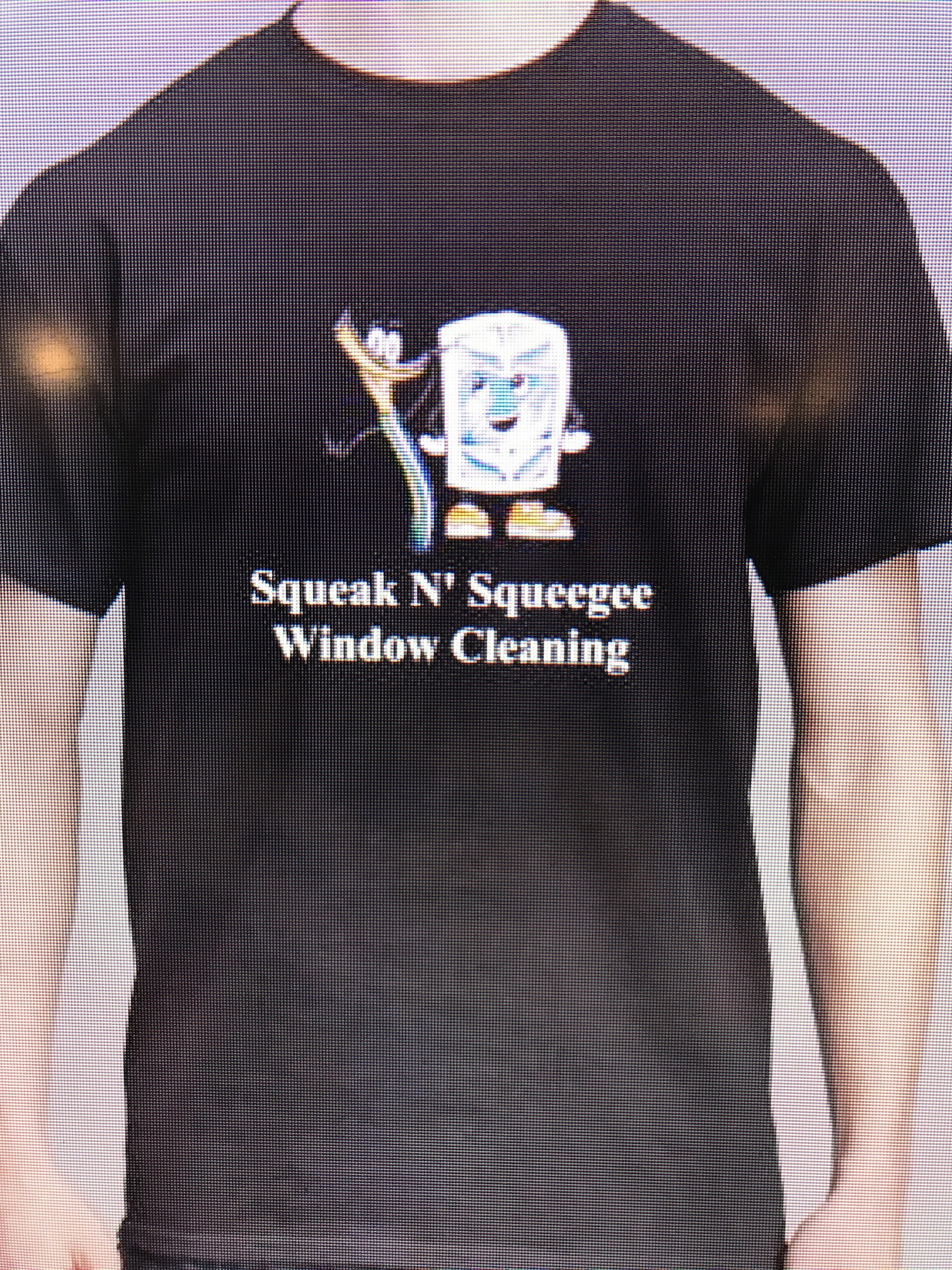
Do you think I should do this or make it Squeak N’ Squeegee Cleaning Experts like my business name… I was thinking saying window cleaning conveyed not only the service I want to always push but to perhaps help convey the meaning of my toons?
It looks better with out a name. 
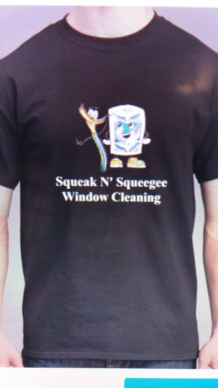
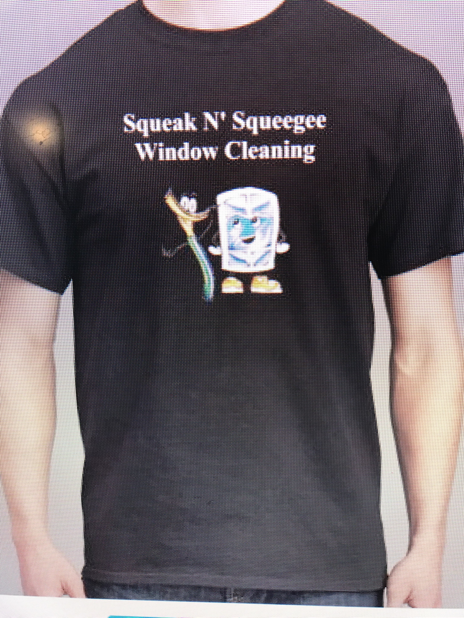
I like it. I would also try placing the logo second. Compare those.
Good luck 
What do you mean placing the logo second?
Wording first, with your logo underneath.
Hmmmm over thinking lol?
Too much time today. Got in so much excercise and fun, and got to hang with the kids. Thursday’s are my “day off”…
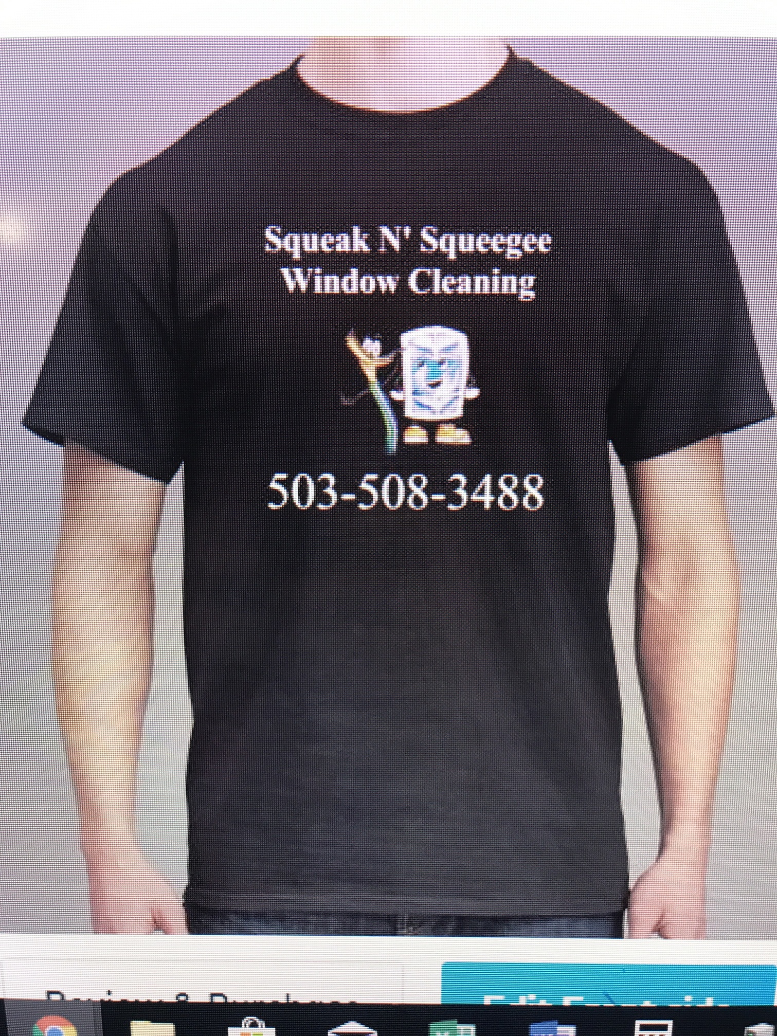
Maybe this??
I prefer #2. There is a downward cascade effect with the text on top of the logo.
So not the one with phone number?
Wasn’t sure if I took it too far…
With a shirt less is more. It depends on what you want to get out of the shirt. Is it for marketing or just to look professional on the job?
If it’s marketing the most important piece of information is what you do and it should therefore he the largest and stand out. The second most important piece of information should be your contact information and it should also stand out. For marketing anything else on the short will distract from these two essential pieces of information and should therefore be minimized by being with very small or non existent on the shirt.
If it’s just to look professional on the job the most important piece of information is your company and your personal name or position in the company I.e. “Manager” or “Owner”. Anything else is extra.
I’m guessing you want both. I need that case your logo and name on the front left breast and name or title on right front breast. Then on the back on top big and bold is what you do (not multiple services, pick one, the main one) then your phone number underneath still bold but a little smaller than what you do, nothing else as anything else will just distract from the two most important pieces of information.
5 Likes
